Tinuiti’s New Customer Insights Tool: A Better Way to Know Your Customers


Have you ever wished your audience personas could get much more specific? Maybe overlay consumer data with your sales numbers to know the location, age, and income levels of your customers? Know with pinpoint accuracy who you were actually reaching and, perhaps more important, who you were missing?
Yeah, we did, too. And – you guessed it – we have good news.
Introducing our brand-new Customer Insights Tool, the latest marketing measurement breakthrough in Bliss Point by Tinuiti’s game-changing tech suite.
Marketers can finally push past “likely” or “probably” hitting their target audiences. This revolutionary tool seamlessly integrates your first-party data with robust TransUnion profiles and verified third-party sources, showing you precisely who you’re reaching.
This level of granularity enables your brand to eliminate waste, drive more conversions, and reach new targets like never before possible. Let’s dive in.
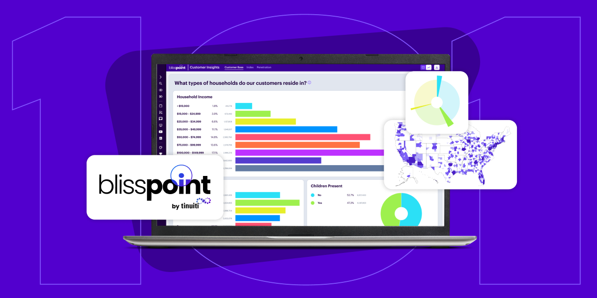
The Customer Insights Tool marries your first-party customer data with TransUnion customer profiles across 14 demographic descriptors, including income, age, household size, urbanicity, ethnicity, education, occupation, marital status, and location.
As soon as data ingestion and matching is complete, you have unfettered access to deeper-than-ever analysis via your Bliss Point dashboard. Get as specific as you want with your targeting; view any and all combinations of demographic metrics and finally feel the unprecedented clarity of knowing precisely who you’re talking to.
Best of all, your performance data stays current and refreshes regularly. Now, you can see the direct impact of your two-month Instagram campaign on Millennial college graduates with a household income of $100,000 – and how to best refine it moving forward.
Adding this tool to your brand’s arsenal also unlocks three new demographic reports, available at any time via your Bliss Point dashboard:
“For the first time in years, cookie depreciation is no longer a concern. With Tinuiti’s Customer Insights, we don’t have to worry about not understanding our customers. In fact, we now understand them better than ever. Obscurity is a thing of the past.”
– CPG Brand and Tinuiti Client
The benefits might already be obvious – but since we’re all about clarity, let’s take a closer look. By better understanding your audience, you can:
Eliminate waste with finely focused targeting. You’ll finally know exactly who’s buying and who isn’t. With this confidence, you can easily refine your audiences, optimize your channels, and eliminate wasted spend through precise targeting, retargeting, and suppression strategies.
Hyper-personalize your campaigns. Customers want to feel known, and now you can personalize like never before. You’ll be able to see which demographic descriptors have the highest brand and product affinity. This means you can both double down on your highest-value audiences and unearth your brand’s highest-intent lookalike audiences to further grow your base.
Galvanize your strategies with deep data. You’ll find directional insights on factors like market saturation, customer income, and more – down to the metropolitan statistical area (MSA)-level. This granular market intelligence enables you to plan marketing and distribution in your most popular locales with robust data behind market gaps and opportunities, industry trends, product strategies, pricing, and more.
Combined with the comprehensive Bliss Point by Tinuiti tech suite – Rapid Media Mix Modeling (rMMM), Always-On Incrementality, the Brand Equity tool, the Creative Insights tool, and robust Forecasting capabilities – your brand will have everything needed to eliminate wasted spend and realize new ways to grow.
Our product suite ensures that your campaigns reach the right people in the right place at the right time – and provide full-picture visibility to adjust and optimize those campaigns on the fly.
Backed by real consumer insights and understanding, your brand can grow smarter via fine-tuned targeting, a data-backed outreach plan, and custom messaging that calls out to your customers.
Let us know if you’d like a tour of the Customer Insights Tool or a Bliss Point suite demo – we would love to show you how to best equip your brand for growth.
