The Top 8 Facebook Ads of 2018


Let’s face it: there are many variables in Facebook advertising that can make the difference between a mediocre ad and one that blows up with engagement and conversions.
You can change up the copy or the creative, revamp a landing page, add in different targeting, keywords and even calls-to-action. CTA options.
The variables are endless.
Analytics can help guide you toward a more effective strategy, as can looking at past Facebook ad examples — including ones that worked and ones that might have missed the mark entirely.
Let’s look at the most effective Facebook ads from last year for some inspiration.
“Great Facebook ads are both engaging and eye-catching while showcasing your value. Higher engagement means cheaper CPC’s and increased CTR. People that see sponsored content in their feed & stop to engage are more compelled to go to a website and purchase.”

-Brent Villiot, Creative Strategist at CPC Strategy
This ad by shoe company TOMS is a good example of how you have to give something to get something. It features a giveaway (who doesn’t like free stuff?), talks of far-off getaways (hello, FOMO) and sleek, eye-catching imagery that would definitely stop a scroll.

Top it off with a few emojis and a simple breakdown of the contest rules (not to mention a promo of the newest collection), and you’ve got a pretty effective Facebook ad example to emulate.
This ad by promotional video tool Promo has all the right stuff. The text is easily digestible, uses related emojis to grab your attention and breaks down the unique selling proposition pretty simply.
A video featuring a funny kid is just the icing on the cake, and the CTA button makes it super easy for users to get more info should they be interested.

Judging by the stats, it was pretty effective, too.
More than 4,200 people liked the ad and another 500 shared it with their own social circles.
Who doesn’t hate meetings? Who wouldn’t want to cut theirs down by a whopping 25%?
Bringing up this common problem is a great way to draw attention as well as drive up Slack’s overall relatability.

Throw in a crazy unicorn image and a rainbow, and you can bet this one had scroll-happy meeting-goers stopping for a look.
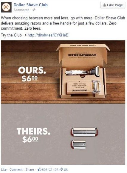
This ad from Dollar Shave Club does a great job of illustrating a point visually.

Not only is it easy to glean just how good the club’s price is compared to its competitors, but it also shows it’s sleek, pared-down branding — something that likely resonates with the no-fuss men it markets to.
Less is more in this simple yet beautifully crafted PayPal ad.

Its bright and bold colors ensure users stop scrolling, while its one-liner copy and pared-down icons clearly articulate exactly what PayPal is selling and the value it can deliver.
Few people will skip over a bright pink “$1,500 per week guarantee” in their feed — especially if Lyft has done their targeting right.

The image clearly explains what the guarantee is, what the job entails and who it’s with — all with just four words and a few car icons.
It’s simple, it’s easy to understand and it’s a good way to draw in leads who have decent potential to convert.
Using lingo isn’t great when you’re casting a wide net, but when you’ve got a super drilled-down product and a targeted ad campaign to support it, jargon away.

“Shipping” is a common term used by software developers, and it’s one that shows on-the-hunt dev pros that Hired means business.
The graphic is also a fun and kitschy nod to what its leads do best.
This is a great example of how the best Facebook ads combine timely and trendy with tried-and-true branding.

It uses space to call attention to the curiosity-stoking “Fake news” headline, while also positioning New Scientist as the trusted and proven publication that it is.
Adding in a discounted subscription isn’t a bad idea either.
As you can see, the best Facebook ads combine creativity, wit and simple, yet eye-catching designs to stop the scroll and draw in potential leads.
Want more help homing your ad strategy?
Next time you log into Facebook, check out the ads using the “View Info and Ads” feature on Facebook.
What works? What doesn’t? What could be done better?
You can learn just as much from bad Facebook ad examples as good ones.
Want to learn more?
Facebook Ads Guide: Setup, Strategies And Tips From The Experts
How to See Your Competitors’ Facebook Ads
