 A merchant’s landing/destination page can be thought of as a window into their store where a first impression is made upon potential customers.
It is a chance to inform, gain the trust of, and win over an audience who may or may not have heard of you before. It can also be the difference between a customer leaving, never to return; or in building a lasting relationship with your site.
Below then is the first in a series of posts of advice that we at CPC Strategy provide some of our merchants that all retailers should look out for in making sure that their landing pages lean toward the latter scenario.
After all, only so much can be accomplished in driving quality, relevant traffic to your site; the rest has to be done on the merchant’s page itself.
And since you’re likely paying for each visitor to your site, you want to ensure that that first impression is indeed a memorable one.
We’ll start with a few of the odd ones (they’re ordered in importance :-)) and finish off the rest at a later date:
1. Page Load Time – One sure way to guarantee that no purchase is made by a user upon clicking through to your site is if your page takes an inordinate amount of time to load, as research has shown:
…16% of people leave the page if it loads longer than 10 seconds and only every second person will wait more than 15 seconds…
In general then, the quicker the load time the better. Longer load times can easily result in lost visitors, thus translating to a reduction in your overall bottom line.
Try to keep large images and flashy effects to a minimum, or even eliminate them altogether. If complex coding is absolutely required, it should be reserved to other sections of the site, but as a rule of thumb, your goal should be to minimize the size/loading time of your landing page as much as possible.
For further details of the importance of load time and optimization tips, be sure to take a look at what Google has to say on the matter.
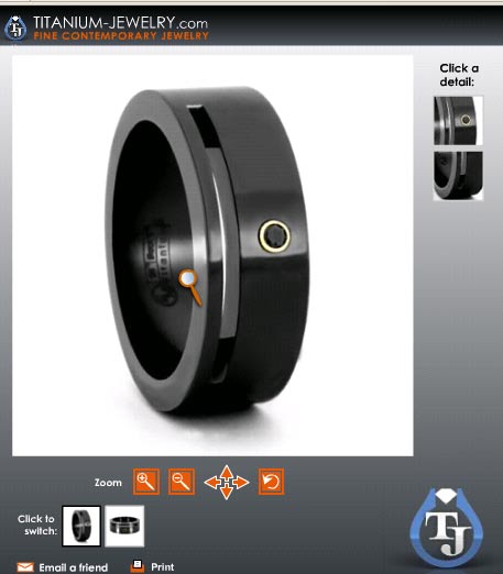
3. Good Image(s) – One of the biggest deterrents for many when making online purchases compared to more traditional means is the inability to physically feel and “test out” the purchase.
The best way then to alleviate this is with a big, clear image of the item being sold, giving users a chance to really feel as if the item is right in front of them, greatly increasing the chances of a user applying the principle stated in #3.
Descriptions such as shapes, sizes, colors, etc. can all be handy as well, but nothing can beat a nice, clear picture. Multiple images are preferable, though may not necessarily be realistic for those with massive amounts of products.
One particular merchant of ours, Titanium-Jewelry saw their sales practically double after revamping their image system to the one seen below (click to view):
So while it might be a major project to rehaul an entire library of your product images, for certain merchants it may just be worth the investment as was the case with Titanium Jewelry.
In our next post, we’ll cover more about not just selling specific items, but selling your company as well.
Until next time, we’ll see you on the engines–with a nice, simple landing page hopefully.
-Tien
You Might Be Interested In


