Mobile Optimization To Increase Retail Site Conversions in 2017


The growing need for retailers to integrate mobile-friendly sites is nothing new to the ecommerce world. It’s estimated by 2017, mobile ecommerce sales will total $109 billion and those numbers continue to grow every year.
As I’m sure most of you remember, in 2015 Google announced that non-mobile friendly websites could suffer within Google’s search results due to the the expansion of mobile friendliness as a ranking signal.
As of early November, Google has already started testing Mobile-first indexing – meaning Google will primarily use the mobile version of a site’s content to rank pages from that site.
As Google continues to adjust their algorithm to reflect the way people shop – it’s more important now than ever before to take a deep dive into your retail brand’s mobile site to see where improvements can be made.
 “Google’s more recent “Mobilegeddon” update is nothing compared to how important a mobile optimized experience will be in the near future,” Matthew Campion, Director of Optimization Services at Teknicks said in a recent interview with CPC Strategy.
“It is clear that shopping on mobile is becoming more of the norm. Not only is an optimized mobile experience important for SEO, but it is a must-have to maximize ecommerce transactions.”
As an agency managing hundreds of retail brands, we believe it’s essential for retailers to test & analyze how customers interact with their mobile site – to gain a deeper understanding of what impacts conversion rates and user experience.
*From homepage and site navigation to search capabilities, below is a list of actionable mobile site optimizations every retail brand should implement to increase conversions and improve user experience in 2017.
The ability to search for items from your homepage is one of the most important aspects of mobile site design.
According to Google, users typically respond better to open text search boxes (vs. search icons or logos) at the top of the page as seen in the Home Depot example below:
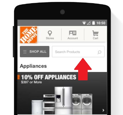
But having a search bar at the top of your mobile page isn’t enough to keep your customers engaged.
Search relevancy by way of autocorrect & spelling corrections also help users to “smart-search” and keep them on track to find their desired product. It’s important to make sure the most relevant results are populating in the search bar.
Typically, customers will base their site experience on what first shows up in the search results, and it’s unlikely they will navigate through multiple product pages to try and find the product they are looking for.
One way to improve search relevancy is to integrate search filters. As seen in the example below, search filters allow the user to hone in on their desired result(s).
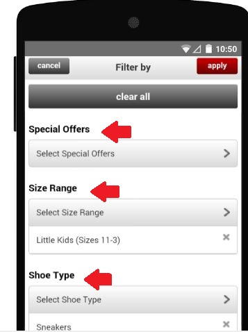
Sometimes users will abandon a site simply because they were served too many search results and don’t want to spend the time looking for a certain product or group of products.
Filters allows the user to sort your products by rating, brand, price and more. With that being said – you don’t want to integrate so many filters that you pigeon hole your results.
Too many results can be just as detrimental as too few – the key is to find a healthy balance that allows shoppers to navigate based on what they prefer to find. One way to aid your customers throughout the shopping process is to list the number of results based on a specific set of filters (as seen below).

Mobile requires clear call-to-actions (CTAs), which should be present on the homepage, above the fold. In addition to placement, CTAs should also be colorful and stand out against the background scheme, creating a sense of urgency using words such as “Buy” or “Add to Basket”.
Similar to CTAs, you should optimize your mobile site menu so it is short and direct. By segmenting into categories – this allows your shopper to see their options as distinctive and clear – ultimately avoiding any unnecessary confusion while navigating the site.
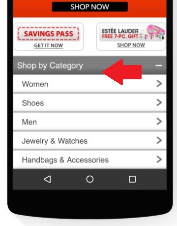
Homepage accessibility is vital because there’s nothing worse than diving deep into a product category section and not being able to navigate your way back to the homepage.
It’s recommended to use your logo (at the top of your page) as a navigation return button so users can easily backtrack to begin a new search and check out additional features or offers highlighted on the homepage.

Although promotions are important to highlight special offers and draw customers into your funnel, if your ads overshadow mobile site navigation or other functional buttons necessary for a positive user experience, you run the risk shoppers will become frustrated and abandon the site completely.
Keep your promotions in check and don’t let them overpopulate the screen.

The conversion process is where a majority of your shoppers will jump ship. Thankfully there are a number of tactics retail brands can leverage to keep the process quick, seamless and secure.
Before you ask your shopper to register their information – whether it be through a login or purchase, give shoppers adequate time to browse your site.
If you push this process too early on – you increase your chance of a customer getting frustrated – abandoning the site.
The benefit of mobile is you can shop anywhere /anytime but with 24/7 access there also accompanies numerous distractions and an overall shorter attention span.
I know that when I’m shopping on mobile – I’m usually finishing up my lunch break, or about to jump in my car to meet a friend. Whatever you’re doing – you are on the go and every second counts.
Allowing users to complete their purchase as a guest – gives them the chance to buy your product without having to commit all of their info. Of course, retailers can always offer incentives to complete the full registration and if I’m sitting on a long bus ride home – I might opt for that option because I have the luxury of time. But if not, you shouldn’t have to sacrifice the entire conversion opportunity.
As seen in the Macy’s example below – customers have the option to check out either way – depending on what they prefer during that moment:
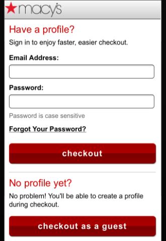
On the flip side, if this is a returning customer – auto-populate pre-filled saved information or leveraging a third party payment service such as PayPal, Amazon Payments, or Google Wallet can also streamline the checkout process.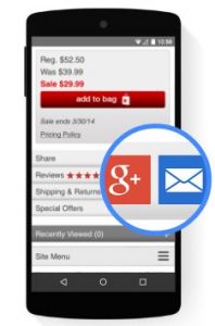
If in the event, your shopper still isn’t ready to make a purchase (or maybe they are interrupted during the shopping process) – retailers should make it accessible to save-to-cart or share the product with a different platform – such as Facebook, Twitter or Gmail.
Some users (no matter how streamlined the checkout process) are still not comfortable converting via mobile – but if they have the ability to email / share the product with themselves (or send to a friend for a second opinion) – you increase your chance of completing the conversion at a later date – especially if you integrate advanced retargeting tactics.
Not sure how your mobile site ranks in Google’s eyes? There are several tools available to help retailers test their site for mobile-friendliness including:
* Credit to Google & AnswerLab for Mobile Best Practices Research Study
