In 2017, Amazon started testing out some pretty cool new interactive features for their A+ Content offering for Vendors.
FREE GUIDE: The Brand’s Guide to Amazon A+ Content
Some major brand names were pre-selected to participate in the content testing group including: Bose, Sony, and Ghostbed.
It’s important to note this is completely different than Amazon’s free A+ Content. If you’re not familiar with A+ Content, definitely check out our guide first.
If you’re already leveraging A+ Content for your brand, keep reading to see what else is available for vendors using Amazon Premium.
Premium A+ Content Features
Below get a handle on the powerful (and beautiful, to boot) features, modules, widgets, and other interactive capabilities available to vendors.
1) A+ Premium Content Video Loops:
As you can see in the example above, this module allows Vendors to include a high quality video loop of their product.
Click here to see the module live on the item’s detail page listed under “From the manufacturer”.
2) A+ Premium Content Hover & Click Interactive:
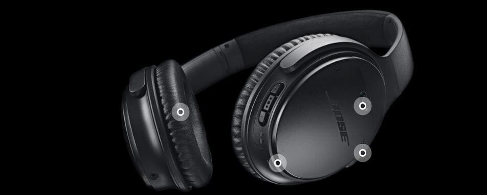
This module from Bose allows the shopper to click (or hover) on 3 different feature points to reveal more product details.
3) A+ Premium Content Slider Gallery:
The slider gallery above features four different tabs. For this product, you can click on each tab to reveal a graphic and description or use the gallery slider to scroll side to side.
Check out the slider in action here on Sony’s page.
4) A+ Premium Content Video:
This video from Sony shows a 1.15 minute (high definition) video of a man using their wireless headphones. You can also click on the left video to expand it to a full screen.
5) A+ Premium Content Testimonials:
We’ve never seen testimonials featured within A+ Content before. We’re not sure if the Vendor can pre-select the testimonials featured or if Amazon automatically populates the customer feedback. Either way, this is a level of customer transparency shoppers are likely to benefit from.
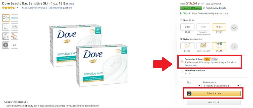
6) A+ Premium Content Subscribe & Save with Buy Box Anchor
This module really stood out to us for a number of reasons. First of all, it incorporates a video, similar to the module we just described above. It also includes a clip describing Amazon’s Subscribe & Save program.
Subscribe & Save is a program allows Amazon customers to sign up for regular deliveries of products they use frequently including toilet paper, dish soap, toothpaste, and baby diapers in exchange for a discount, as well as free shipping.
When you click on the Subscribe and Save button on the right, you are anchored to the top of the product detail page, where you can select “Subscribe & Save” within your purchase order.
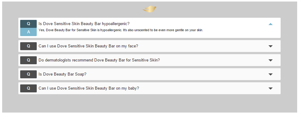
7) A+ Premium Content Product FAQ
8) A+ Premium Content “In the Box”
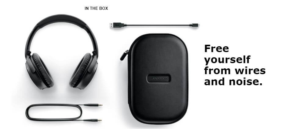
This module from Bose, shows the customer exactly what comes in the box, which can definitely add to the user friendly experience.
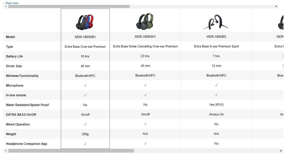
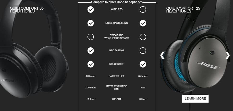
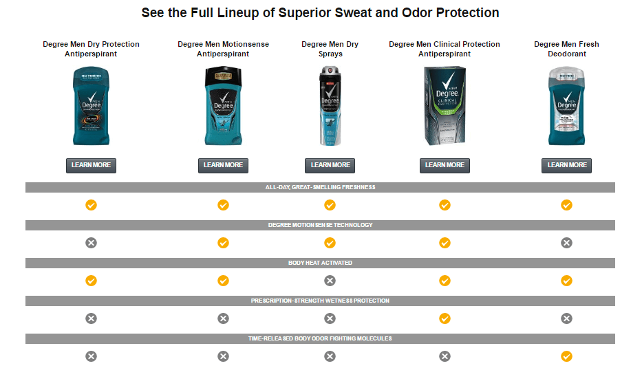
9) A+ Premium Content Product Comparison Chart Widgets
Here’s three different kind of comparison charts we have not seen before. The chart above also incorporated a slide capability to scroll through and compare specific products against each other.
10) Increase in Number of A+ Premium Contnet Modules
Overall, we’re seeing an increase in the number of modules allowed on a product detail page. For the Dove example listed above, we saw about 7 modules total in comparison to the 5 module maximum that is permitted within Amazon’s current A+ Content program.
11) A+ Premium Sponsored Products & Mobile Friendliness
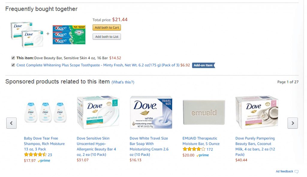
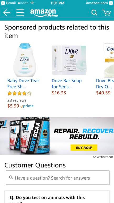
A+ Premium Content pushes the detail page Sponsored Products carousel pretty far down the page on the mobile app (see below), leaving them right above the customer questions. On desktop, the Sponsored Products carousel remains above the A+ Premium Content.
“While we don’t get placement data, you’d imagine having A++ Content (or Premium A+ Content) on a detail page would have the side benefit of reducing the number of clicks to a competitor’s Sponsored Products ads on the detail page for mobile shoppers,” Pat Petriello, Head of Marketplace Strategy at CPC Strategy said.
“This, to me, looks like it was designed for the mobile experience and adapted to desktop, since these look a lot cleaner in the mobile app.”
Amazon Premium A+ Content on Desktop:
Amazon Premium A+ Content on Mobile:
Have you tried using Amazon’s Premium A+ Content for vendors? Let us know in the comments!
You Might Be Interested In


