Crafted from audience insights, performance data, and imagination, our approach to creative unleashes bold, innovative solutions driven by metrics, not opinion.
Turning insights into action, our performance creative strategy blends data with imagination to hit your goals. It’s not just about looking good—it’s about getting results.
Our expertise lies in pinpointing and capitalizing on pivotal moments along your customer’s journey, ranging from seasonal milestones to cultural trends. Our data-driven, moment-based approach allows us to create content that truly speaks to your audience, building stronger bonds and driving conversations (and conversions.)
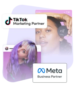
Our proactive position as the earliest consistent adopters of emerging platforms and trends positions your brand at the forefront of change. Leveraging strong partnerships with industry giants such as Meta and TikTok means innovative and effective creative solutions for your brand ahead of your competitors.
Our creative strategists view every piece of content through a dual lens of creativity and strategy, ensuring alignment with your brand’s business objectives. From audience insights to media planning, our full-funnel approach guarantees that creativity serves as a powerful lever for performance.
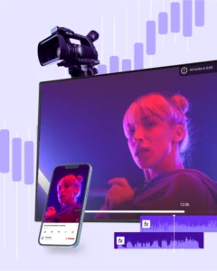
Our multidisciplinary team of data-fluent copywriters, graphic designers, and video editors transforms your brand’s vision into reality. Our holistic Creative Strategy is rooted in your business objectives, guaranteeing that each piece of creative work contributes to your overall brand goals.
With constant measurement with our proprietary tech, Bliss Point by Tinuiti, we’ll keep iterating on the creative product until it’s maximizing impact on your business outcomes. Our Creative Insights tool enables us to deliver personalized, scalable creative that captivates and converts.
Creative That Connects and Converts
With a focus on brand-building and conversion-driving, we leverage your unique brand story to create a unified and impactful customer experience across the channels that matter most.
We create for:
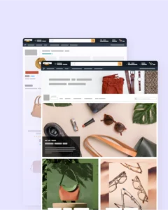
Compelling A+ content, Stores, DSP & DPI Creative? Done. We’re also all over advanced creative features like video, lifestyle images & store spotlights, creating a unified customer experience everywhere you sell.
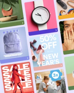
In the lightning-speed environment of social media, we keep you ahead of the moment with quick-turn performance analysis to deliver & iterate creative.
We create:
High-impact units • Video • AR/VR Experiences
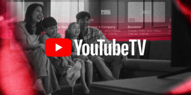
Tinuiti creates original streaming content and can also help you repurpose your existing video to tailor it specifically for the OTT, cTV, Linear & Audio environments.
We create: Original Video Productions • Tailored Content • Audio Content • Audio Ads • Podcasts
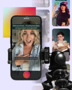
Most UGC partners stop at content creation. We source creators, produce assets, and bring the operational rigor needed to turn creator content into a repeatable growth channel. From strategy to scripting, we deliver high-converting, creator-led assets designed to scale your paid ads and organic channels.
We create:
Creator Videos • Product Demonstrations • Testimonials • Unboxings • Lifestyle Content • Paid Social Assets
Always Out Ahead
The industry comes to us for our expert insights, predictions, and analysis. You should, too.


