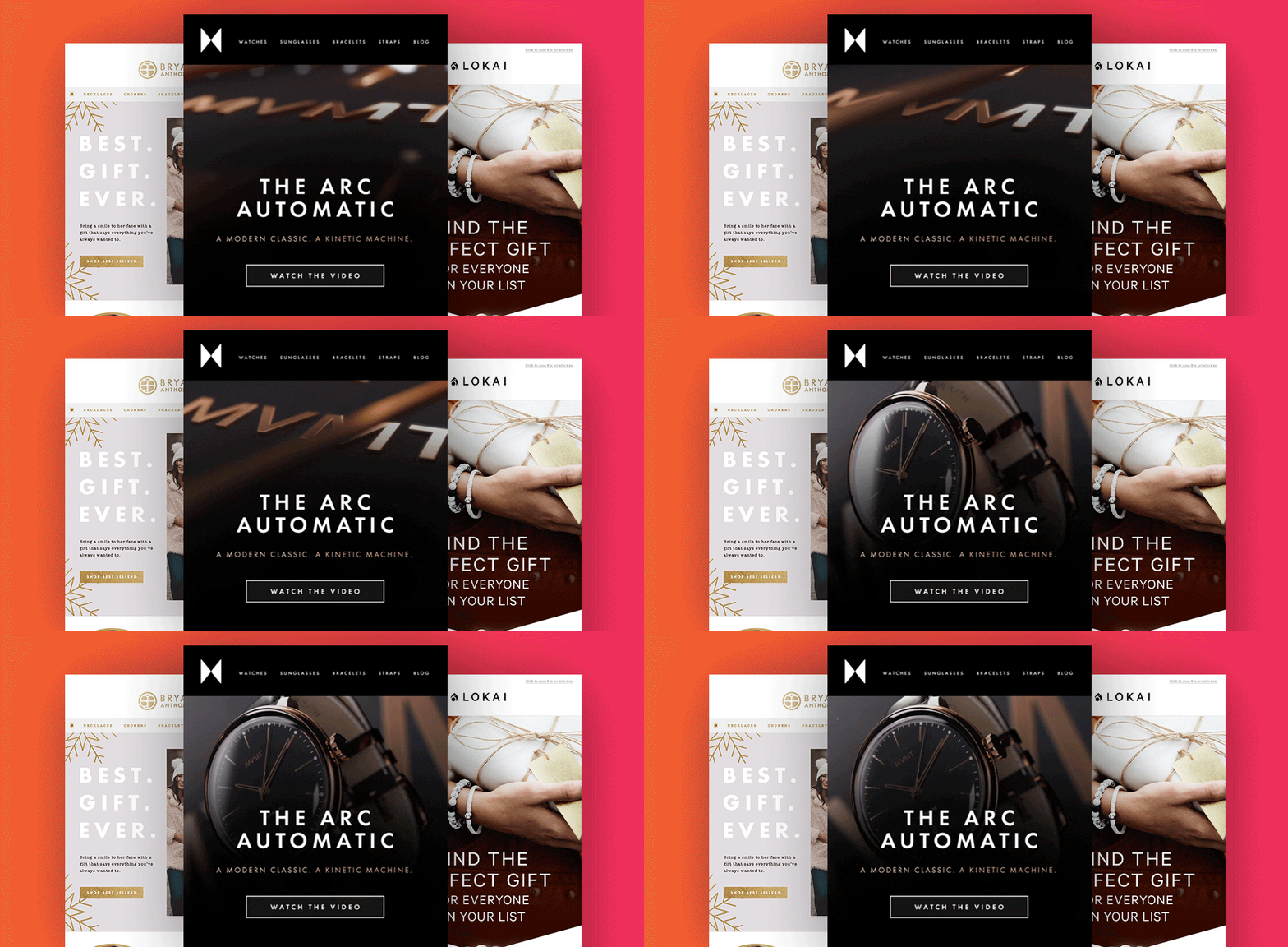
7 Ways to Power Up Your Emails With Animation


Animation is a great tool to leverage within email marketing to help your brand stand out from the crowd.
Animated elements allow you to:
Due to various levels of support across inbox providers, animation in email marketing requires thoughtful design to ensure deliverability. Using animated GIFs is the best way to ensure your email renders well across the majority of email clients.
There are endless ways to use GIF animation in your email designs, here are seven of our favorite email animation examples.
An easy way to draw attention to your headlines is to add simple frame animation highlighting each word.
If you have a variety of products or photos you want to highlight without the email feeling content-heavy, you can easily rotate photos using frame animation.
With custom photo assets, you can bring a photo to life by showing slightly different angles or a sequence of events with a simple frame animation.
Who said your animations have to stay in the same place in the email? You can create depth by having your animation float above other design elements and throughout the email.
If you want to bring your hero layout to the next level, consider using video as the background element instead of a static image.
A great way to grab attention is loop a texture to give it motion. This technique is more complicated as you’ll need to find the right assets to feel seamless, but if done correctly, it can be very effective!
A great way to promote clicks, this mystery sale promo GIF leaves the view curious what is next by leveraging animation.
Beyond these great creative examples, here are some of our best practices for exporting your GIFs to make sure they delivered, opened, and clicked:
The more creative you are, the more sophisticated and attention-grabbing your email animation will be.
If you’re looking to add creative innovation to your email designs (or any other designs for that matter), our Creative Services team is here to help.
Want to learn more?
Anatomy of An Email: Email Template Design Best Practices
3 Emails You Should Be Optimizing Right Now
