Anatomy of An Email: Email Template Design Best Practices


At first glance, email template design seems pretty straightforward. Put your logo in the header, drop in your content, and close it all out with social links. Simple enough, right? Not so fast.
Email templates serve a dual purpose: to increase the efficiency of building campaigns and to create a consistent and cohesive branded experience in the inbox. Your template helps subscribers immediately recognize who the message is coming from, instantly building trust that the content was generated by a credible source, allowing engagement to naturally follow.
While there are a few key elements that every template design should include, the way an email is structured can make or break the success of a campaign. In fact, Tinuiti’s CRM + Email team has seen email template optimizations lead to double-digit increases in click-to-open rates.
Before you code it and forget it, consider the following email template best practices:
Strong branding is the backbone of any email template design. Beyond the logo, utilizing branded colors, fonts, and layouts will help create a cohesive user experience and give subscribers confidence they’ve landed in the right spot when they click through to your site.
Consider the use of navigation links in the header that mirror your site’s top-level nav to help your contacts get to desired content quickly, regardless of the focus of the email.
Finally, don’t let your footer be an afterthought. Utilize this space to feature links and icons for your social profiles to drive engagement across channels, include required information and links for CAN-SPAM compliance (physical address, opt out / preference center links), and leave space for any necessary terms and conditions that coincide with email promotions.
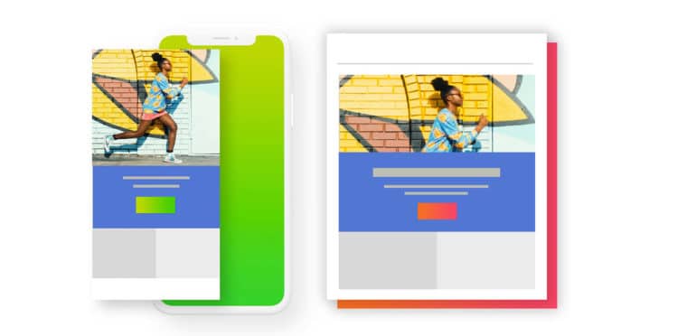
On average, 46% of emails are opened on mobile devices so it’s well past time to start designing mobile-first. Email layouts should facilitate easy reading across devices and push the viewer through the design toward the call to action (CTA).
Mobile users are used to scrolling on their devices; while it’s ok for an email to be long, make sure you’re prioritizing your primary CTA in the hero so the user can quickly see what you’re asking them to do. CTAs should stand out: use an eye-catching color or style to be obvious as a link, and make them appropriately-sized so they’re clickable on desktop and mobile.
Give your email design some breathing room. Whitespace supports the overall hierarchy of a design, while allowing your audience to interpret and digest the content.
Without ample whitespace, designs easily become cramped, dragging down the level of sophistication, disengaging the viewer. A little extra padding between content blocks is especially helpful to prevent content from looking cluttered on small devices.
The importance of quality of assets cannot be overstated.
Typography is the unsung hero of any great design. Use hardworking typefaces that give the email clear hierarchy and make copy easy to read. Avoid using outdated, hard-to-read typefaces like script fonts that complicate the content. When using HTML text, use a web-safe font to avoid any rendering issues.
When it comes to photography, the higher the quality the better. This includes well-lit product shots, and engaging lifestyle imagery (and/or video). If your company doesn’t have the budget to generate these in-house, stock imagery can be a great resource (if you’re picturing awkward smiling faces on a white backdrop, it’s time to revisit stock – it’s come a long way in recent years).

With fierce competition in the inbox, animation is a great way to stand out and create a memorable message. Elements such as GIFs, Cinemagraphs, and animated icons captivate and delight audiences, and can help showcase multiple product features or the breadth of your catalog in the space of a single static image.
When used properly, animation elevates a campaign and increases engagement. Avoid animating for animation’s sake; use these elements only when they add to the design in a meaningful way.
While templates help designers and coders produce emails efficiently, without visual variety, end users are likely to become fatigued. Avoid sending subscribers the same exact design over and over again by creating a few template options that can be cycled through.
Adding variety while maintaining branding and overall visual cohesion will keep your audience wanting more and ultimately generate higher levels of engagement.
Executing strong email design is easier said than done, especially if you’re lacking in experienced staff. If your brand is looking for strategic guidance in email strategy or creative services, Tinuiti can help. Get in touch to learn more about what our team of experts can do for you.