11 Email Marketing Design Tips to Drive More Revenue


When you think about what factors and processes are needed to get the most out of your email marketing campaigns, you might consider these first: more sophisticated personalization, leveraging first-party data more effectively, or more precise targeting and timing.
While those are all important, there’s another more fundamental aspect of email marketing that’s just as critical to success: email design.
With more than 333 billion emails sent and received every day, and adults logging more screen time than ever before, it’s never been more crucial to have well-designed emails that can quickly cut through the overflowing inbox clutter, capture recipients’ attention and compel them to take the desired action.
Whether you’re looking to supercharge your email newsletter or inject new life into your lifecycle email campaign strategy, here are 11 email design tips and examples that can drive site traffic, purchase intent, conversions and revenue.
“All aspects of email design – including accessibility, readability, layout and responsiveness – have a huge impact on open rates and conversions. In reality, email marketing design is the gatekeeper to campaign success.”
— Samantha McGrady, Tinuiti Strategist, Email & SMS

You might not consider all these quote-unquote “design” components, but they all play a central role in how an email is perceived and consumed.
All elements of an email come together to create an overall design. Whether that design is cohesive or advances the objectives of the email depends on how well the individual elements are executed. Here are 11 tips for making email design work for you.
Mobile-friendly email design is a must. While the exact percentage of emails opened on mobile devices like smartphones and tablets vary by source, it’s estimated that over half of all emails are accessed on mobile. That means ensuring an email displays correctly and can be read easily across devices, screens and resolutions are essential. If an email displays poorly, it’s likely to be deleted in under three seconds.
Utilizing a responsive email template will automatically adjust your email to fit the screen it’s being viewed on, whether that’s a desktop, laptop, smartphone or tablet. Most drag-and-drop email builders feature built-in responsive design templates, but you’ll also want to keep mobile formatting in mind when considering image size and the length of copy blocks within the email.
One key aspect of email design that goes hand-in-hand with responsiveness is accessibility. Accessibility refers to an email’s ability to be received and understood by persons with disabilities or using assistive devices. So just as responsive design ensures that emails can be accessed across device formats, good accessibility practices preserve an email’s usability regardless of the recipient’s circumstances.
An accessible email will have a logical flow and high readability in terms of descriptive subject lines, links and headers, and larger and well-spaced typefaces. It will also use high color contrast and utilize alt-text liberally. Perhaps most importantly, an accessible email will not lean too heavily on visuals or hide information in images, as adaptive tools like screen readers can struggle to convert them.
Keeping accessibility top-of-mind is important for reaching the maximum percentage of your subscribers or target audiences and contributes to good overall email marketing usability.
Pre-header text used to be an afterthought, and many marketers defaulted to the first few words of email body copy. Now, because of the way emails are displayed in mobile and desktop inboxes, pre-headers are widely recognized as the second-most important text element after the subject line. Pre-header text indicates to the reader what the email is about; it’s essentially a visible meta-description of the email.
As such, the pre-header text should complement the subject line and reinforce the critical call-to-action within the email. It should, like the subject line, entice the recipient to open the email and keep reading while also reading while offering an informative preview of the email itself. And it needs to accomplish all of this concisely in an abbreviated space.
Crafting a compelling subject and pre-header pair can feel like writing poetry, but getting it right can significantly impact open rates and conversions.
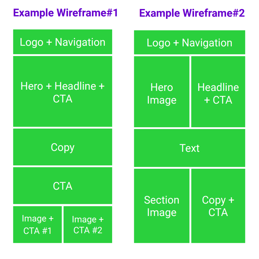
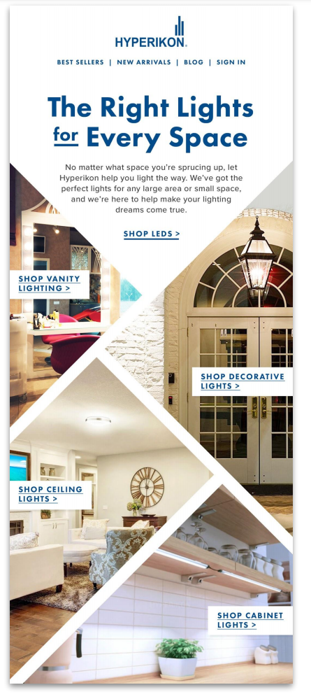
The layout is the most recognizable aspect of email design and likely what most people think of first when considering the design elements of an email. Layout determines the flow of your content and the order in which your readers consume information. The most basic principles of email layout are maintaining organization and logical consistency, capturing attention through aesthetics, and manipulating the recipient’s eye where you want it to go.
Many email templates use the following common layout patterns, each of which guides the reader’s attention in specific ways:
These principles are laid out in the following two wireframe examples of common email layouts. Notice how both lean on the reading path of the human eye while maintaining a recognizable hierarchy and putting vital information up top:
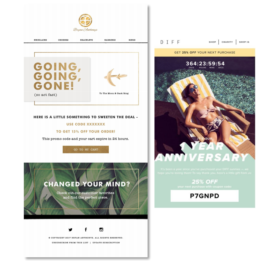
Color scheme is an essential element in any design, and emails are no exception. The right combination of colors – or the strategic limitation of a color palette – can elicit emotion, direct attention to important content, reinforce brand image or distinguish a single email from a series or campaign.
There is plenty of room for experimentation with color in email marketing. Still, good general rules of thumb are to avoid clashing colors or using too wide a variety of colors, use bright colors sparingly, and stay consistent with color usage across branded marketing assets. And as with accessibility and responsiveness, it’s also important to consider how an email is being viewed; for example, if being read on a mobile device in “dark” mode, pure black text can appear illegible.
It’s important to remember that color isn’t limited to graphical elements or iconography in the email; the text color used and dominant color in embedded images or photographs should also be considered. These colors should work in harmony to support your content, brand and the purpose of the email.
An organized layout and strategic use of color will go a long way toward making an email readable and effective. Ultimately, though, the information you want to communicate stems from the email copy itself. One hard and fast rule for text in an email is to be clear and concise.
Remember the 333 billion emails sent and received last year? Your target audience received some of those, and they almost certainly didn’t read every word of every email they received. So many of those emails were probably never opened, thanks to poor subject lines.
Emails should draw the eye with an attractive design but be easy to skim. Get to the point quickly, or risk ending up in the trash.
When in doubt, follow these guidelines:
“Reduce the cognitive load. We really want to create our emails to be clean and concise.”
— Sammi Nutsongtat, Klaviyo Design Specialist

Of all the potential touchpoints a recipient might have with your brand, the email you just sent them is unlikely to be their first. That makes it very important to keep email design consistent with your overall brand design.
Incorporating strong branding – not just a logo or a tagline, but brand-specific colors, imagery, typography and content tone – helps email recipients identify the message’s source and provides a more cohesive experience from the inbox to the landing page. That can reduce your bounce rate as users interact with your brand across different channels.
A good branding evaluation question to ask: If I removed our logo from these email designs, would our subscribers identify our company?
Your brand’s identity tells your story, so it’s important to be conscious of your email branding. Branding should remain consistent across all channels, whether email-to-email or email-to-website.
Using a consistent typeface in email design can reinforce your brand image and identity, though, like color, there is some opportunity for experimentation. The most important thing to remember about typography is that it should be easy to read at a skimming pace and shouldn’t detract or add confusion to the message.
Emails can also contain more than one kind of typeface, for example, one font that looks better at a larger size for headers and another that looks cleaner for entire sentences of body copy. That said, too many different fonts in an email can make it hard to read. A limit of three fonts per email is a good common-sense rule. Again, a drag-and-drop email builder usually has several typeface options and suggestions for specific email elements or sections.
Personalization is one of the dominant themes across the marketing and advertising industries right now, as technological advancements and the rise in importance of zero- and first-party customer data have made true one-to-one, brand-to-customer engagement possible. Email marketing, which was perhaps the first marketing vector to make widespread use of basic personalization (think mail merge and auto-filled salutation lines), can also incorporate more sophisticated personalization techniques – and should.
The goal of personalization should be to make an email meaningful and valuable to the recipient. That means incorporating bespoke, custom content blocks based on customer data, including insights like purchase history or position in the customer lifecycle or buying journey. Narrow segmentation can help target specific customers, and personal touches like incorporating profile information or preferences can help humanize your brand and create stronger relationships.
In short, you should seize every opportunity to include more personalized elements in your emails.
This might seem like email marketing 101, but no list of email marketing optimization tips would be complete without addressing calls to action or CTAs. Usually rendered graphically as a button, a good CTA should concisely describe the exact action the email reader can expect upon clicking and be placed at a point in the layout where the next step is logically implied.
Effective CTAs typically appear at the bottom of a section in a contrasting color to the email’s overall color scheme. Multiple CTAs can be used – some research suggests that having more than one CTA increases click-through rates – but only where the natural progression of the content suggests they appear. As with many of the design tips presented here, CTAs should be used in a cohesive, consistent manner.
Consistency isn’t just important within an email; it’s also important across campaigns. Design shock, or suddenly presenting drastically different creative to an existing audience like your subscriber base, can impact the success of an individual email or an entire campaign.
When updating your email designs, consider rolling out the changes in an iterative fashion or testing the new creative out on a small group of subscribers before rolling it out to your entire audience.
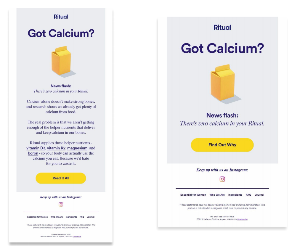
As the example above illustrates, gradually transitioning to a new layout while keeping many other design elements consistent helps minimize the effect of design shock. Keep this in mind as you embark on new email campaigns or make universal changes to your email marketing approach.
You can put as much thought and preparation into email design as possible, and the email might still fall short of performance expectations. The only way to ensure a successful campaign and maximize conversions is to engage in A/B testing by sending slightly different versions of an email to distinct segments of your audience. It’s a straightforward process that many email platforms support, but sadly, nearly 42.9% of marketers don’t know what to test.
When assessing an email design’s impact on an audience, there are various things you can test to help drive higher clicks, conversions, or overall performance. These include:
Once you know what to test for and have identified what you’re trying to prove, run a few test emails to sample groups, isolating one variable at a time over a series of weeks. Evaluate which works best for reaching, resonating with, and converting the most recipients, and you’ll gradually improve your conversion rates.
There is no shortage of email design tools available to help you get the most out of your email marketing strategy. Some are full-service email-building platforms, while others are helpful stock image sites or graphics libraries. Here are a few of our favorites:
Klayvio is a well-established, full-service email marketing platform optimized for ecommerce and featuring sophisticated personalization tools. Klaviyo’s robust library of customizable, responsive templates, support for A/B testing, and dynamic content capabilities can help users of all levels put email design optimization tips into action.
Need a more comprehensive and data-driven approach to email and lifecycle marketing? Our own Performance Creative offering is based on moments that matter and features integration with multiple channels and touchpoints throughout the customer journey.
It’s perhaps unsurprising that one of the biggest names in design software also has one of the most robust stock image catalogs available. Adobe Stock allows users to search for specific image types or browse by category, ensuring you’ll find the perfect photos or images for your email campaign.
Any design process – including email design – can be collaborative. Figma provides a platform to facilitate that collaboration that includes several email-specific features, including a library of visual assets teams can build themselves.
Design is a central aspect of email marketing performance, and getting it right can be the difference between a positive ROI campaign and a forgettable brand encounter. You can probably think of several marketing emails in your inbox that slapped a basic template together with uninspiring (and uninspired!) copy and called it a day. Or maybe not, because you deleted them without getting past the subject line.
Your email campaigns can help solidify customer relationships and prospects through accessible designs that embrace solid layout principles, on-brand typography and images, a concise and catchy subject and pre-header, logical CTAs and compelling copy. You’ll ultimately generate more opens, leads, conversions and revenue for your company, too.
Editor’s Note: This post was originally published by Greg Swan in August 2019 and has been updated for freshness, accuracy, and comprehensiveness.