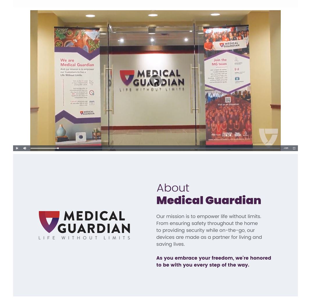
Medical Guardian Gains Impressive Results Following Amazon Creative Refresh with Tinuiti

While the path to success will always look a bit different from business to business, one of the same bricks you’ll find within them all is among the simplest, and arguably the most important: They offer a product or service that people want and/or need.
For some of these successful businesses, the brands themselves played an active role in creating that want or need. For others, it was always there in some capacity—food, clothing, shelter, etc. Whichever camp your brand falls in, lasting success will depend on a number of factors, including:
Tinuiti’s Amazon Creative team recently had an opportunity to help Medical Guardian enhance some of those elements of lasting success with a new custom Amazon store design, and strategic use of fresh A+ content pages. Let’s explore the process for each, and take a look at the early results.
Before our team dives into an Amazon Creative project, they work closely with the client to learn more about their business objectives and goals, and who they are as a brand. Other areas we focus on in the research phase include:
For this project, the overarching question the creative assets and design needed to answer for was: Who is Medical Guardian, and what makes them special?
The answers to those questions includes, but is not limited to:
In short, when Medical Guardian came to us, they had already tackled many of those elements of lasting success we highlighted earlier, from stellar reviews to best-in-class features. They had all the right ingredients, but needed that Amazon-specific recipe for the best presentation.
Once our team worked with the client to understand what the creative needed to cover, they got to work on their specialty—the how of best conveying all those key elements in a way that is most beneficial for the brand, and most likely to drive performance on Amazon.
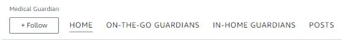
As the front door to your personal store-within-a-store, it’s important that your Amazon store homepage is designed with Amazon’s ecosystem in mind, while also telling a consistent brand story. This same necessity carries over to your category pages and PDPs (product detail pages), with each requiring its own set of creative considerations. Some ways our Marketplaces Creative team accomplished this for Medical Guardian include…
To optimize for the best user experience, you must first consider where a majority of the traffic to your Amazon store pages will be coming from, including the homepage. Unlike the traffic to your own website’s homepage, typically, a high volume of the traffic to your Amazon Store’s homepage comes from users already shopping on Amazon.com.
Visitors often navigate to Amazon store homepages by clicking on the brand link within an Amazon PDP. These visitors include potential customers who landed on a PDP through a variety of potential avenues—including ads or an organic search result on an Amazon SERP—but may not be quite ready to purchase just yet.
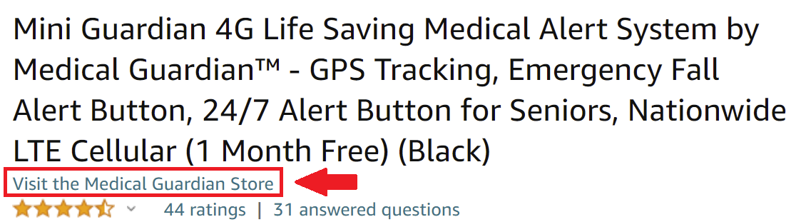
If their apprehension comes from wanting to learn more about your brand and/or full product lineup first, they will often click the link within one of your PDPs—as shown in the example above—to be taken to your store.
The homepage should be tailored for the audience that comes in organically, giving your brand story and top products premier placement.
Your store will include a primary, top navigation, but it’s important to think of all the links and tiles within your homepage as a secondary navigation that helps funnel shoppers to the products and information they’re most interested in.
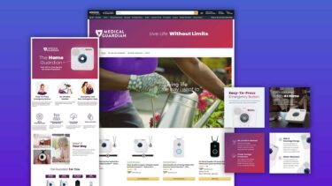
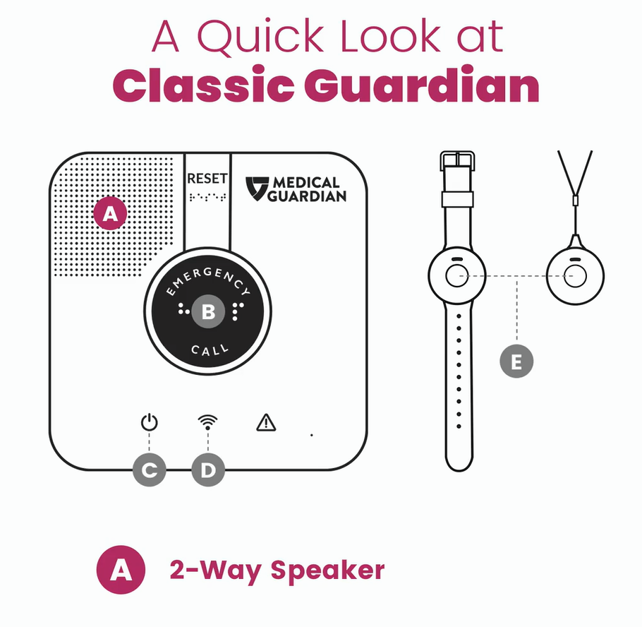
Here are some ways our team did that for Medical Guardian, reviewing the homepage design—one of four pages we designed for this project—from top to bottom:

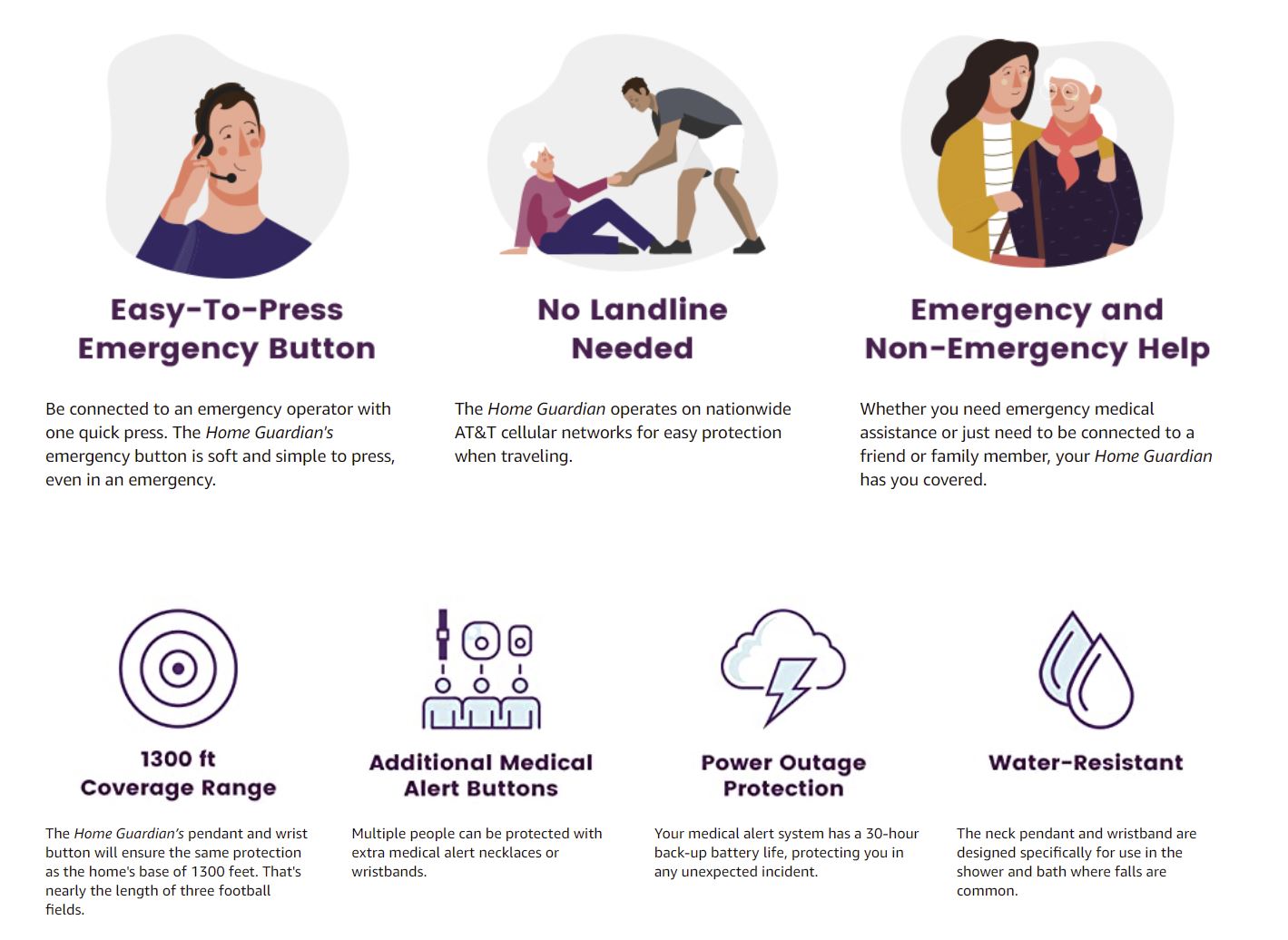
At the top of the homepage, shoppers are presented with a clean, clear header image that features:
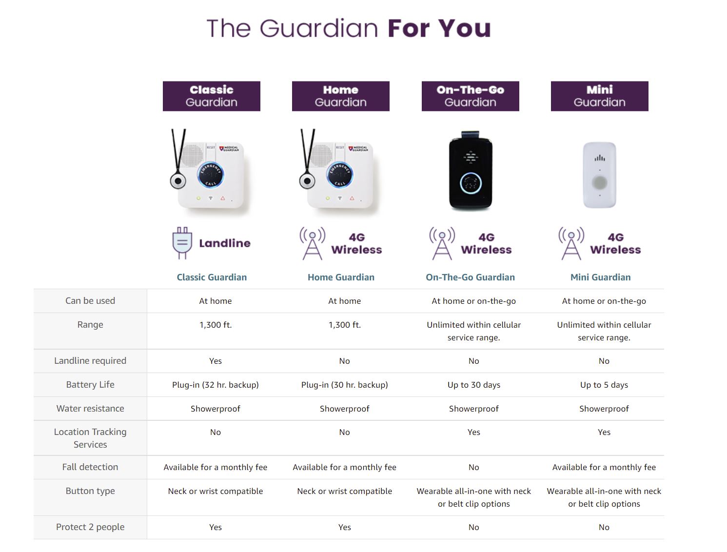
In the research phase, our team learned that while there are a variety of different features from device-to-device, all belong within one of two primary categories: those designed for on-the-go use, and those designed for use within the home.
To make navigating to the full selection of in-home and on-the-go devices as easy as possible, Tinuiti created dedicated category pages for each, and included links to both within the top navigation.
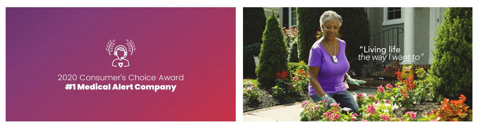
Next, our team leveraged a relatively new autoplay video tile that is often overlooked or underutilized by brands in Amazon Stores. We created the video using existing assets, thoughtfully selecting which overlays, graphics, content and cuts to use while adhering to Medical Guardian’s latest brand style guidelines, and Amazon’s own guidelines. This presented an eye-catching, easy-to-understand way to showcase:
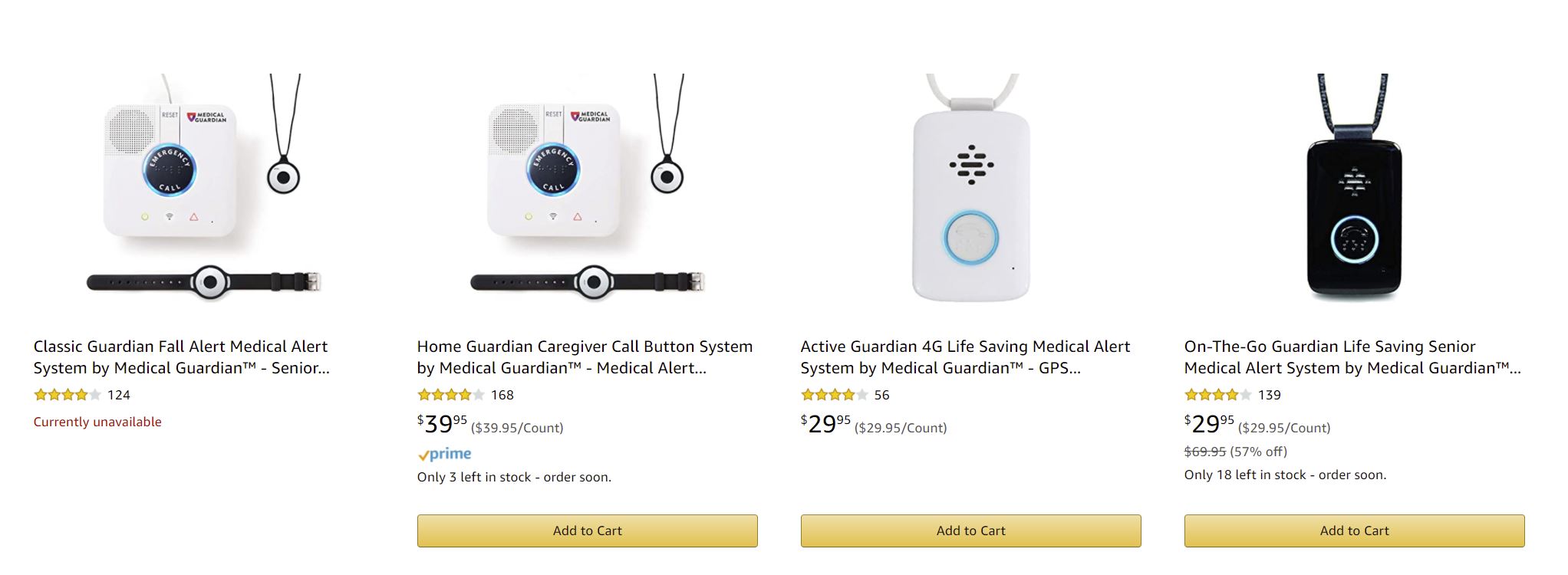
Next, shoppers are presented with Medical Guardian’s flagship products. Items that are in stock feature a convenient ‘Add to Cart’ button so customers can make their purchase quickly and easily.
If shoppers want more information before adding to cart, they can hover over each product and click the new ‘Quick Look’ feature for additional details, or click the product name itself to be taken to the full PDP.
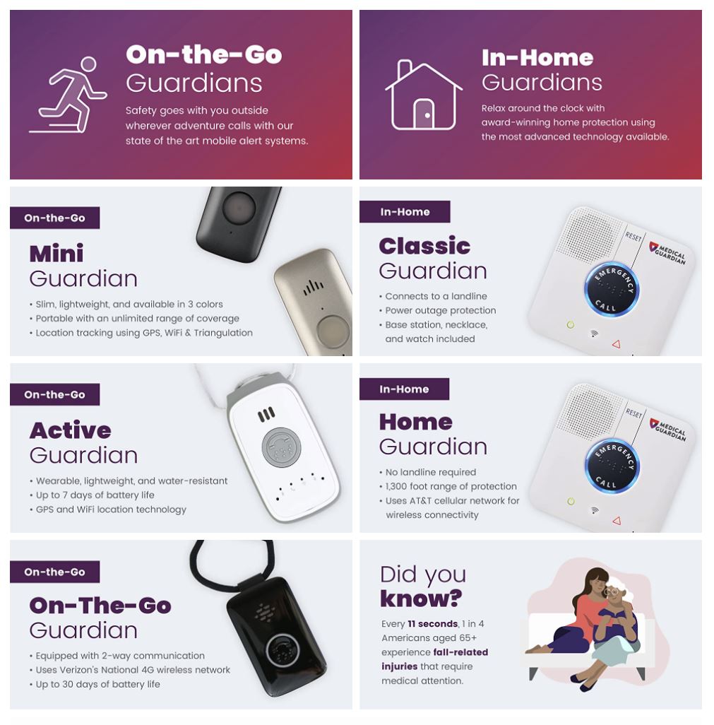
As mentioned above, our team learned in the research phase that all of Medical Guardian’s emergency response devices fall within one of two categories: those designed for on-the-go wear, and those designed to be worn in the home. This informed the primary navigation, and carries through to the tile-based secondary navigation.
Clicking the upper-left On-the-Go Guardians tile will take shoppers to the same category page as On-The-Go Guardians in the top navigation; similarly, the upper-right In-Home Guardians tile does the same for the In-Home Guardians category page in the top navigation.
“Consistent design is important. We aren’t just building pages; we’re building a brand, and a shopping experience for that brand on Amazon, that is tailored to that channel.”
— Hiram Cruz, Creative Director at Tinuiti 
Shoppers also have the option to click to specific PDPs for some of Medical Guardian’s most popular products.
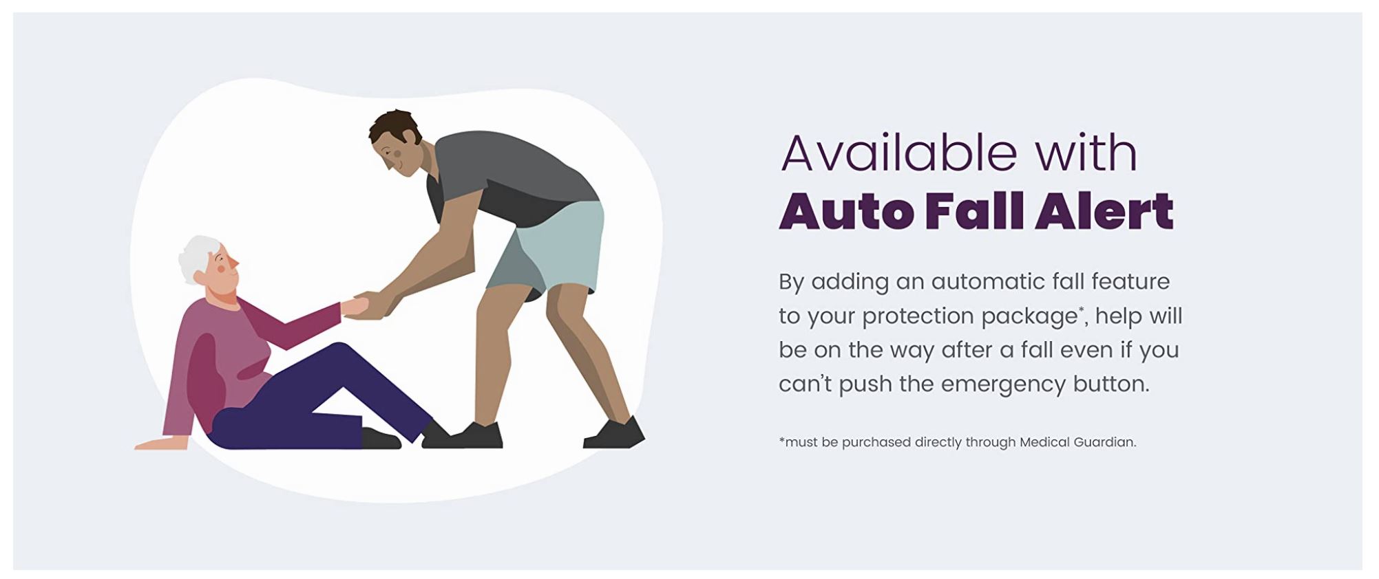
For this section, our Creative team highlighted how Medical Guardian stacks up for three of the most decisive brand considerations to make when comparison shopping for medical alert devices.
This bottom-of-homepage video provides information about how the alert system itself works so shoppers know what to expect in the event they ever experience an emergency and need to activate their unit.
Directly below the video, the brand and its mission statement is reinforced to ‘wrap up’ the homepage. This section serves as a footer on every page of the store for consistency, and to reinforce the ‘Medical Guardian experience’ within Amazon.
Amazon gave brand owners the opportunity to better share their brand story and value propositions with the launch of A+ content years ago. The enhanced text, image, and video features that premium A+ content provides offers the space needed for detailed product descriptions, supportive copy, high-quality images, video elements, infographics, and more.
When used effectively, A+ content can play a pivotal role in increased sales and reduced returns, as shoppers are given the necessary information to make an informed purchase. However, despite its name, not all A+ content has truly earned the grade.
While the option for brands to use basic A+ content is free unto itself—with premium A+ content offering even greater features at a cost—the more time you invest into the strategic creation of that content, the better results you’re likely to realize.
Our Amazon Creative team knows how to best utilize modules, image types, and textual elements to provide shoppers with the information and confidence they need to make an educated decision. They flexed their creative muscles to do just that for Medical Guardian, as highlighted in the examples below.
Sales: +152% increase
Orders: +41.6% increase
Conversion Rate: +4.7% increase
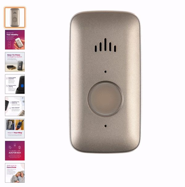
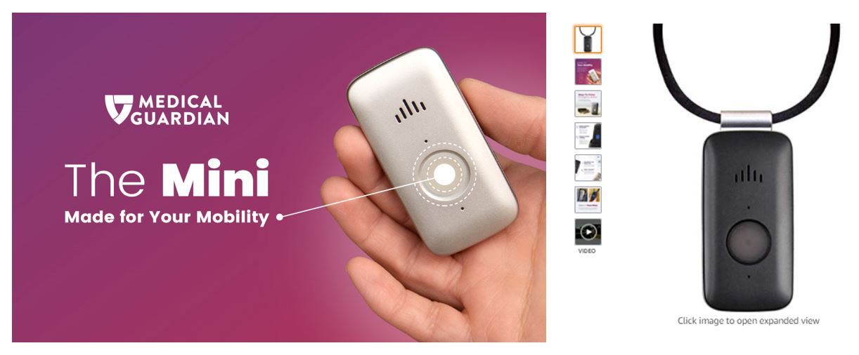 A+ content enhancements to the popular on-the-go Mini Guardian PDP resulted in:
Sales: +30.34%
Conversion Rate: +0.20 Points
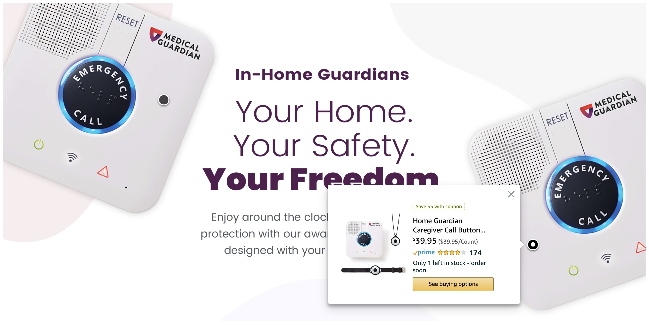
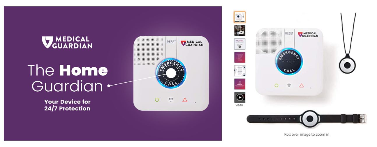 A+ content enhancements to the popular in-home Home Guardian PDP resulted in:
Sales: +147.24%
Conversion Rate: +0.44 Points
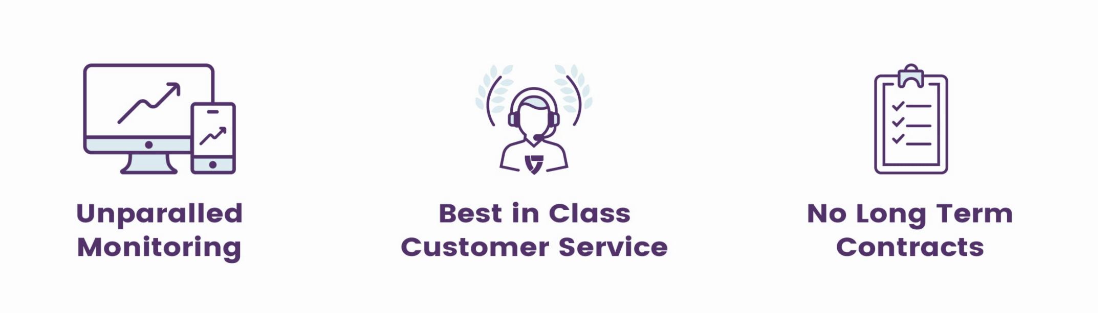
Now that we’ve explored how we help clients stand out from their competitors, we want to highlight some of our own strengths and differentiating factors:
“Our team takes pride in our thorough knowledge of the Amazon guidelines, and stays up-to-date on the newest modules, tiles, trends, Amazon releases, restrictions, and more. We combine our extensive Amazon knowledge—having worked in this space since Amazon stores were merely a single Brand Page, and A+ Content was one large ‘Enhanced branded image’— with our knowledge of the brand to strategically design the best Amazon creative for them.”
— Francis Bonilla, Senior Manager, Creative Services at Tinuiti

Ready to learn more? Contact us today to chat with an expert!