Did we think email rendering could get more complex? It just did.
Dark mode is one of the latest major mobile UI changes that impacts how your audience views your emails. It has undoubtedly created new challenges, but coding for dark mode is an important update to make for email accessibility purposes.
Here’s an overview of what dark mode for mobile is, why it’s important for email accessibility, and some tips for optimizing your email marketing for dark mode users.
What Is Dark Mode?
Dark mode is a feature on mobile devices that allows your UI to invert light colors to dark and dark colors to light.
Dark mode was introduced to smartphones as a way to increase battery life by changing the required brightness of a screen. It’s also an important change for increased accessibility to reduce eye strain and provide an improved user experience for those that have a visual impairment.
Dark mode is available on many popular apps and as an optional theme on several smartphones. The benefits dark mode brings to consumers means it’s here to stay, which also means it time for email to adapt.
How Does Dark Mode Impact Email?
Email dark mode isn’t black and white.
Dark mode actually becomes very complex in HTML emails since there are three variations that impact the way your email renders, depending on the email client you use.
The chart below demonstrates how specific email clients and devices are impacted.
1. Not Impacted
For subscribers viewing your email in iOs or Apple mail, the UI of their mobile phone may be in dark mode, but HTML emails are not impacted.
2. Partially Impacted
HTML emails for these clients are changed for light areas only. Light areas are changed to dark, but dark areas are not changed to light.
3. Fully Impacted
HTML emails are changed for both light and dark. Light areas are changed to dark and dark areas are changed to light, which can significantly change the overall look and readability of the message.
| Device + Email Client | Dark Mode Impact Level |
| iOS Mail | Not Impacted |
| Apple Mail | Not Impacted |
| Outlook.com | Partially Impacted |
| Outlook 2019 (MacOS) | Partially Impacted |
| Outlook (iOS) | Partially Impacted |
| Outlook (Android) | Partially Impacted |
| Gmail App (Android) | Partially Impacted |
| Gmail App (iOS13+) | Fully Impacted |
| Outlook 2019 (Windows) | Fully Impacted |
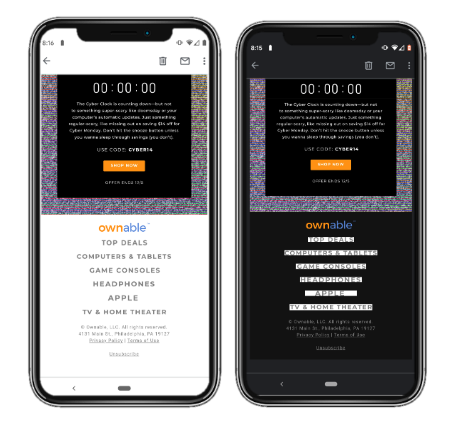
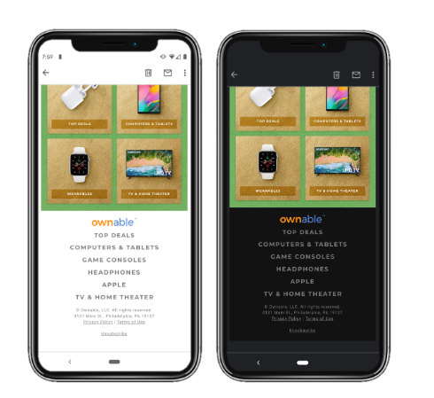
Currently, there is no way to know if someone is reading your email in light or dark mode so it’s challenging for marketers to understand the impact.
Optimize Your Emails for Dark Mode
We recommend optimizing your email template design for dark mode, including your logo, header, footer, and even body images to work for both light and dark modes.
It is recommended to use transparent PNGs with dark text and transparent backgrounds when possible, along with other coding modifications to improve email rendering.
The way email renders is constantly changing and using a vendor like Litmus or Email on Acid to support QA across most widely-used email clients and devices is the best way to ensure an optimal viewing experience for your user base. We recommend dark mode is included as a part of your rendering QA process just as you complete previews in both Outlook and Gmail.
Email QA vendors have begun supporting dark mode previews, but not all email clients that have dark mode are included at this time. Using personal devices is recommended where inbox preview tools are lacking.
The Future of Dark Mode
Dark mode is still a relatively new accessibility feature and is expected to continue to expand across email clients.
We can anticipate advancements will come to allow for reporting on dark mode, and that additional preview options will become available in email QA tools. It’s ideal to start optimizing your emails for dark mode now, just as you would optimize your email for other elements of email accessibility.
If you want to learn more, check out our article on email design best practices here.
Email is just one part of your lifecycle journey. Your brand needs to build an integrated messaging approach that prioritizes the customer for a more comprehensive (and human) communication journey. Learn more about Tinuiti’s Lifecycle Marketing approach across email, mobile, and on-site.
You Might Be Interested In


