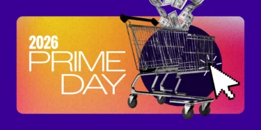
11 Amazon Storefront Examples [Best Designs for 2025]


The Skinny: Amazon Stores are free, self-managed tools that allow brand owners to create a customized, multi-page shopping experience to build brand equity and showcase their full product catalog. By leveraging creative modules like shoppable images, video backgrounds, and intuitive navigation, brands can improve aesthetics and drive both on- and off-platform traffic to increase Marketplace success.
Amazon Stores allow brand owners to design and create multipage stores to showcase their brands, products, and value proposition on Amazon. Long gone are the days when Amazon sellers didn’t have the tools they needed to build brand equity and promote shopper loyalty.
Once launched, Amazon Stores quickly shifted from being a trending Amazon feature to becoming a brand essential for Marketplace success. Not only do the creative features of Stores help to improve the aesthetics of brands on the Amazon Marketplace—they also provide new opportunities to drive traffic (on and off Amazon) to a brand’s entire catalog.
If you’re actively trying to provide a curated collection of your brand’s products—or your full catalog—in a custom-tailored shopping experience, Amazon Stores is where you should be investing your marketing dollars.
But don’t just take our word for it. We’ve got 11 of the best Amazon Storefront examples to prove it.
Amazon Stores are a free, self-managed product that allows sellers to create a customized, brand-centric shopping experience within Amazon.com. Leveraging Amazon’s intuitive, user-friendly template and feature options, brands can design multi-page stores that help shoppers easily navigate to the products and categories that brands choose to showcase. Through the use of customizable colors and an array of image, video, and text modules, they are able to translate their own site and overall brand experience to the Amazon platform.
The primary benefit of Amazon Stores is providing customized content to potential customers while introducing them to your brand. Each page gives brands the opportunity to ‘design it your way’ with lots of supportive content and freedom. It’s basically like creating your own ecommerce website on Amazon.
From tariffs to AI, we asked 1,000 Amazon Prime shoppers about their approach for the biggest online shopping holiday.

As leaders in Amazon advertising, creative development and operations, the experts at Tinuiti have been helping clients build, design and optimize their Amazon Stores for years. We’re always on top of the latest and greatest features, often having beta access so we can experiment with them first. Simply put, we know what works and what doesn’t, and we know a good Amazon Storefront when we see one!
All of the Amazon Stores featured below are well-designed and optimized. We can’t touch on everything we like about each one, but will provide an overview of some of our favorite elements that can inform your own Amazon Store optimization. Let’s dive in!

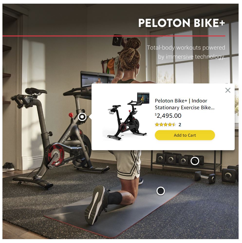
By their nature, Peloton bikes and fitness equipment are all about movement, and they immediately speak to that movement with a looping video at the top of their Amazon Store home page. Conveying a lot of information in a short video, Peloton showcases a cyclist enjoying a class and using Peloton weights and other equipment in the comfort of their home.
Immediately beneath the video, Peloton makes it easy for shoppers to find the product category they’re looking for, with clearly labeled modules for Peloton Bikes, Peloton Guide, Accessories, and Apparel. Each features a singular clean image of a product example, centered in a box with ample white space on all four sides.
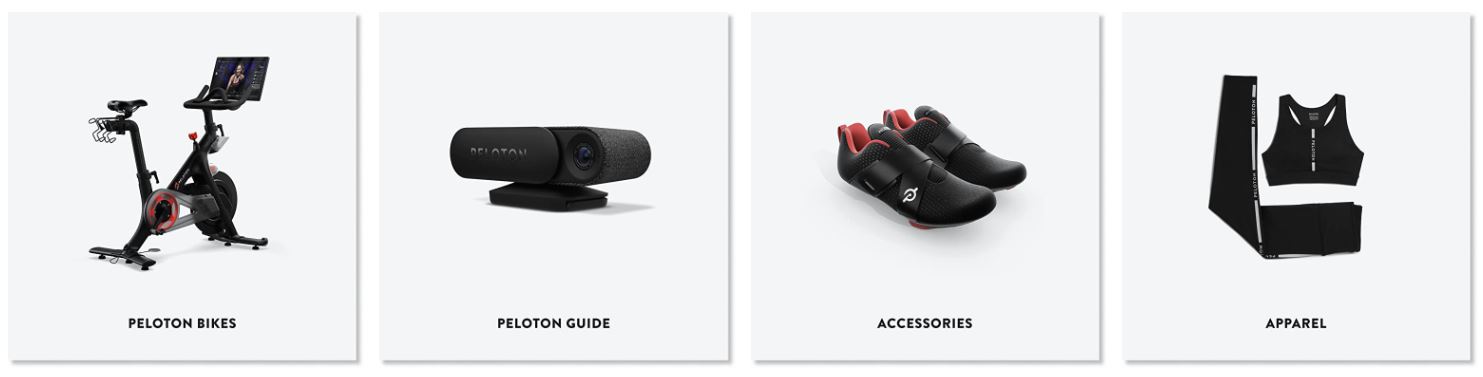
Their top navigation also includes links to these four categories, with the addition of App, Posts, and a Follow button rounding it out.

Within different modules across the home page, Peloton uses image text overlays thoughtfully and sparingly, including just a few words to provide clarity without overwhelming the image.
They also leverage the ability to tag products within an image with a Shoppable Image module. These allow brands to add hotspots to images that display available products, enabling shoppers to add them to their cart right from the image. This brings benefits for the merchant and the consumer alike, as they can be more certain than ever before that they’ve chosen the exact item they’re interested in.
Another exciting benefit of the Shoppable Image module is that it allows brands to showcase beautiful, branded lifestyle photography without sacrificing ‘add to cart’ convenience. By giving shoppers the flexibility to easily purchase your showcased products directly from the attractive imagery that helped earn their interest, brands are given the best of both worlds.
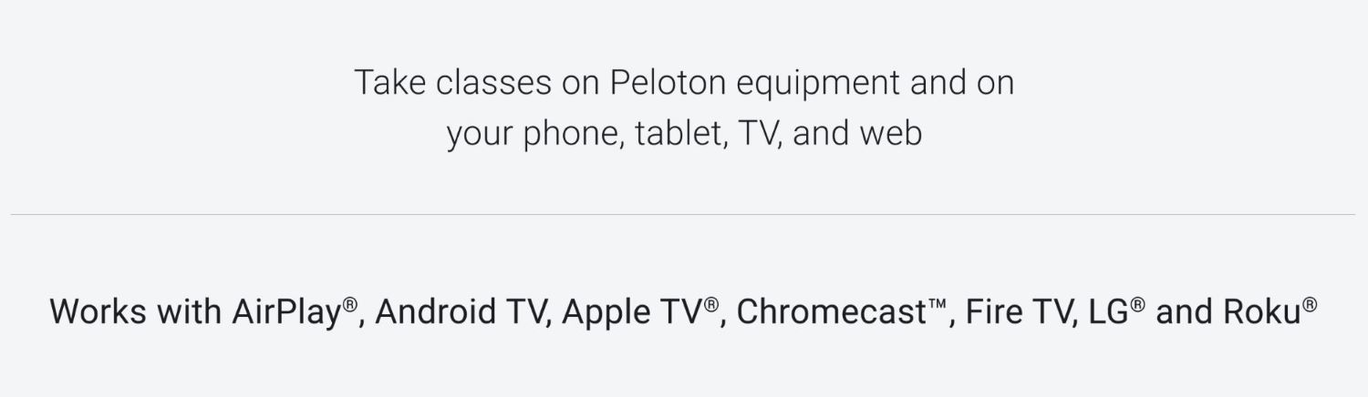
At the bottom of their Amazon Storefront home page, Peloton answers any technical questions shoppers might have by making it clear where you can view classes, and which popular devices are compatible.

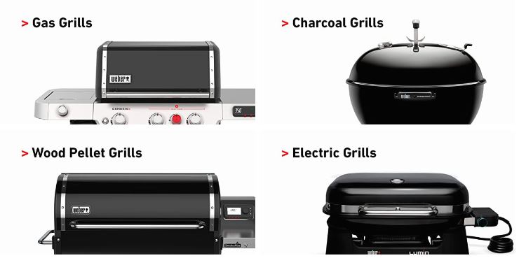
Most folks can agree that nothing says summer quite like firing up the grill for a cookout, but where we differ is on what type of grill we prefer! Weber prominently lists all the available grill types they offer on their Amazon Store home page, with large, clear images and simple text.
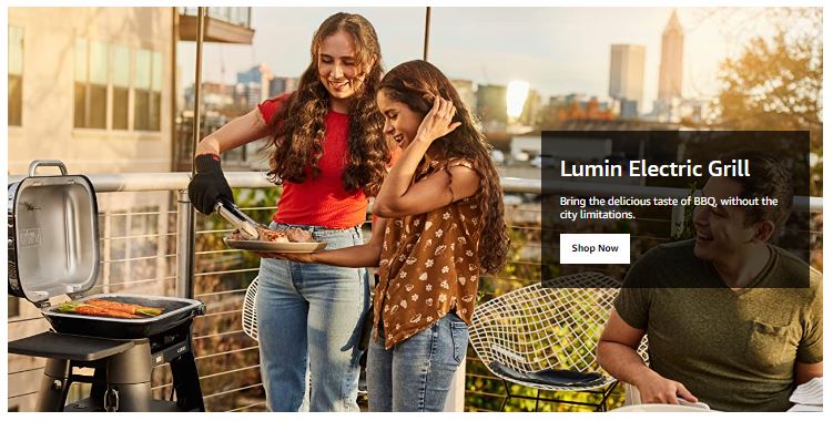
In the large hero image above, Weber hits on a sticking point for many customers—regulations on which types of grills they can use within the small spaces city-living typically offers. This is helpful for shoppers who already knew they had restrictions to consider, leading them directly to the product that will meet their needs. It’s also helpful for shoppers who may not have even considered that they might need a specific type of grill for their living situation.
By making mention of potential limitations in the text overlay, Weber may also be helping prevent returns by leading customers to the right choice the first time.

The Honest Company—or Honest Co.—was founded by Jessica Alba in 2011, and has consistently put their commitment to producing gentle, high-quality products at the forefront of everything they do. Once a brand-new lifestyle brand, Honest has grown leaps and bounds in 12 years, now finding themselves a household name.
Honest Co. devotes the above-the-fold real estate to their extensive collection of baby care products, helping busy parents get right to what they need. And for those shopping for themselves, a visually appealing banner of adult-oriented products—including a Registry option for parents-to-be—catches the eye immediately below.
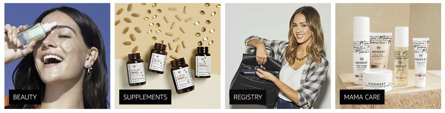
Importantly, while Honest Co. has grown in popularity, they have never wavered in making their brand message loud and clear in all their marketing initiatives, including on their Amazon Store.
Learn more here about work Tinuiti has done with Honest Co.
Bonus Feature: Honest Baby is honestly just as great!
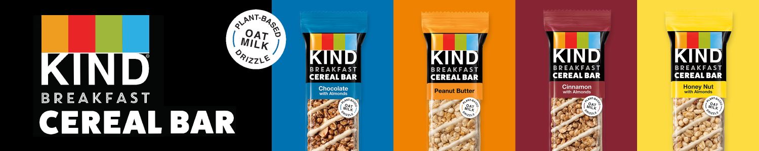
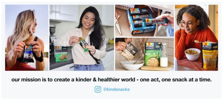
KIND bars are the perfect on-the-go snack for kids and adults alike, with flavors and sizes to suit every palate and appetite. While many of us might simply refer to them as “KIND bars,” there are actually a number of different bar types offered. KIND makes it easy to get right to their nut bars, 100 calorie bars, protein bars, and breakfast bars by offering dedicated links to each category in their top navigation.

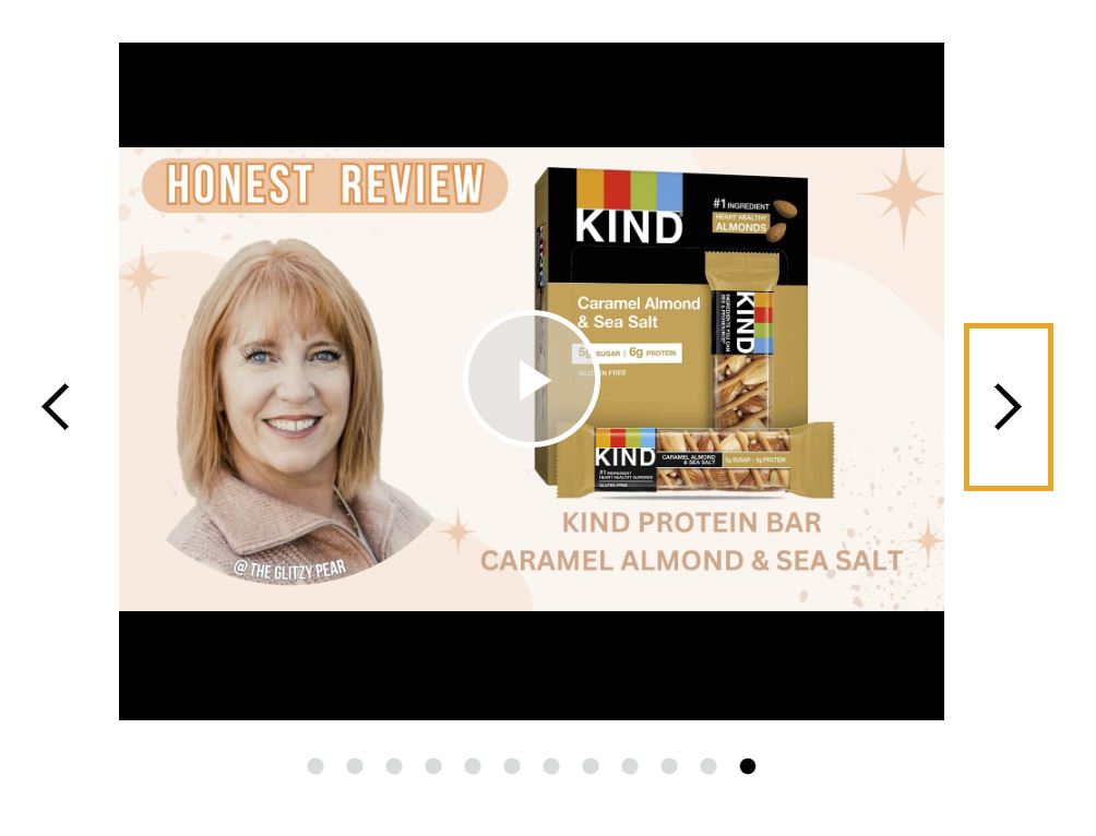
Looking closer at KIND’s product detail pages, we find they’ve included all the information a shopper would need to know about those specific bars to make an informed purchase. In addition to more practical information like whether an item is gluten-free or Kosher, KIND also includes product reviews so interested customers can rely on social proof before purchasing.
KIND closes their Amazon Store home page with a reminder of their mission, and their Instagram handle for easy following.
Learn more here about Tinuiti’s work with KIND.

As more businesses focus on sustainability in their packaging and product design, its importance becomes even more obvious to consumers. Lenovo highlights the sustainability steps they’re taking in an eye-catching, informational video at the top of their Amazon Store home page.
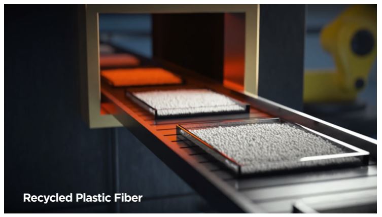
The short looping video shows how old computer parts are being recycled for inclusion in new Lenovo products, with a clear goal: “By 2025, Lenovo aims to integrate 136 million kilograms of recycled material into all of our PC products.”

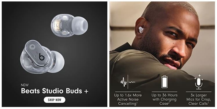
A brand that has grown to be synonymous with headphones for many, Dr. Dre and Jimmy Iovine brought the first pair of Beats onto the scene in 2006. And, as the saying goes, the rest is history.
Beats proves that they know about more than just music with their well-designed Amazon Store that makes it easier to find what you’re looking for than a song in your playlist. Beats takes advantage of valuable above-the-fold real estate to feature one of their newest products, Beats Studio Buds+, immediately followed by clear, clickable images that lead to top categories for all their products—in ear, over ear, on ear, and wireless headphones and ear buds.
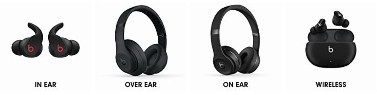
Beats provides the most important product specs for easy comparison across images on their Store, diving more into the science and details behind the technology in videos users can rely on for further information once they’ve narrowed their options.

La Colombe has come a long way from the day they opened their first location near Philadelphia’s historic Rittenhouse Square nearly 30 years ago. But even if you can’t make it to one of their cafes across the US, you can still enjoy the rich flavors and unique beverages they’re best known for.
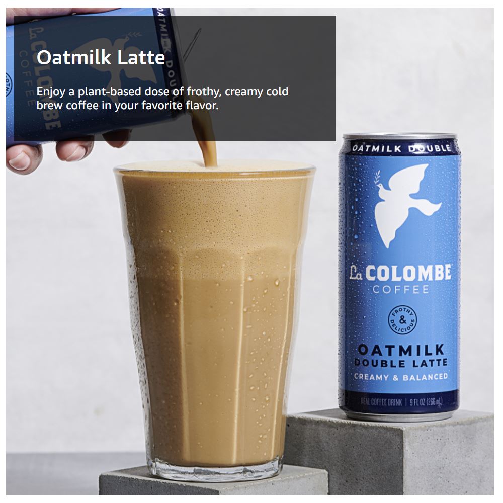
We love La Colombe’s use of oversized images highlighting their newest creations and seasonal offerings, including the delectably frothy Oatmilk Lattes. While the focus is undeniably on the drinks themselves, La Colombe makes every word count in the complementary text overlay, highlighting the most important elements of each respective beverage.
In the short snippet of accompanying text, La Colombe gives us some important top takeaways about the beverage, including:
Just enough information to ensure clicks will be qualified, but not so much information that it overwhelms the image. We’ll drink coffee to that!
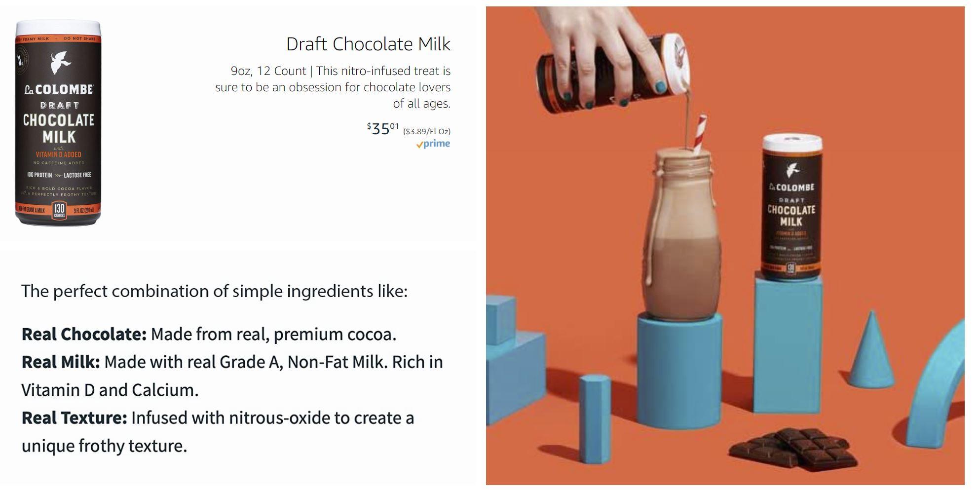
Clicking into the respective categories in the top navigation, we find that La Colombe has artfully combined imagery and accompanying text throughout. On their Draft Chocolate Milk page, we are tempted not only by the slow drip of chocolaty goodness down the glass but also the assurance that this is a high-quality beverage made from premium cocoa and real milk.

Quality pet food brands understand that modern consumers have a lot of options to choose from and to earn a name for themselves in a competitive space, it’s imperative that they produce nutritious food that pets will enjoy.
Merrick highlights that they work with veterinarians, animal nutritionists, and scientists to craft recipes that meet your pets’ needs. Instead of showcasing a background video module highlighting the food itself, they give the most screen time to playful pups and a leaping kitty. While the adorable factor draws eyes in, it also serves to show that Merrick food is designed to keep your pets happy, healthy and active, providing the nutrition they need to be their energetic best.
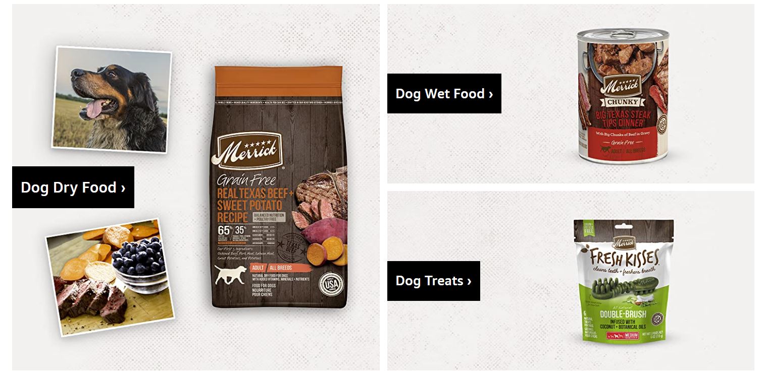
Scrolling further, we see they’ve made shopping directly from the home page oh-so-easy, breaking out products into high level categories that help you quickly find the options available in the categories that most interest you. A “Best Sellers” section works well for pet parents who aren’t sure where to start, while the final images on their store homepage underscore the most important elements of their food, including each aspect of their 5-Star Promise, with a button to “Learn More” if you want the full Merrick story.

If you’ve shopped for a mattress, bed frame, or sofa – or even plush dog stairs to help your pooch easily access a comfy spot on a bed or couch – you’ve likely seen Zinus products returned in the search results more than once.
Zinus makes strong use of an array of Amazon Store features, including a robust navigation, modern lifestyle images featuring their products, popular catalog categories, and best seller and recommended product modules. With the Shoppable Image module below, shoppers can easily build a room styled just like the one pictured in a few clicks.
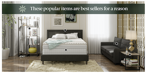
While the store is on Amazon, it feels definitively Zinus, accomplished in part through carrying over the same language style and color scheme they employ on their own website. They do a great job at connecting their brand and value propositions to living the life you deserve.

Founded more than 50 years ago, Verilux light boxes mimic daylight by providing full-spectrum light without the harmful UV rays. For those who can’t get outdoors, or there’s not enough natural light available, HappyLight® Therapy Lamps are a perfect product choice aimed at improving health and overall well-being.
In March 2018, our Amazon Creative Team worked directly with Verilux to design, develop and deploy a customized and responsive Amazon Store site map with multi-level category & product pages optimized to promote an immersive shopping experience. One of the most important aspects of Verilux’s Store was to educate their consumers on their products.
Our team worked directly with Verilux to select the best hero images, graphics, and charts to educate visitors on the unique benefits of their light therapy technology. We also managed all aspects of the Amazon Store submission process. There are a lot of policies and requirements for Amazon Creative. Because our team understands those restrictions and policies, we saved Verilux a significant amount of time on revisions & resubmissions.
When it comes to food and supplement shopping in particular, many of us pay especially close attention to details, especially if we’re navigating allergy concerns or food sensitivities, or want to be certain given criteria are met. Providing us with all the information we need to make an informed decision can quickly become visually overwhelming—unless that same attention to detail is applied to the design of how that information is conveyed.
Protein Puck does an excellent job at quickly providing shoppers with the most important information about their products right from the Storefront homepage, including that they contain plant-based protein, and are vegan and certified gluten-free.
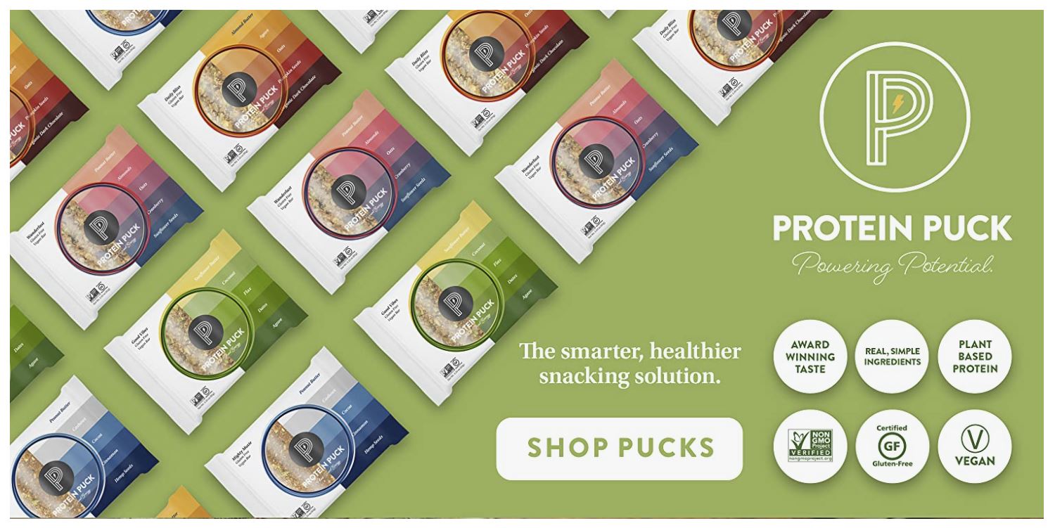
Shoppers who are in the market for protein bars are already among those who are likely to be careful or particular in their shopping habits, and are looking for certain keywords to quickly determine if something is a good fit for them. It’s important that those stand-out terms be quickly visible, and from there you can further explain what each means and why it matters. You capture the attention first using familiar imagery and language that people of a certain diet are wired to look for.
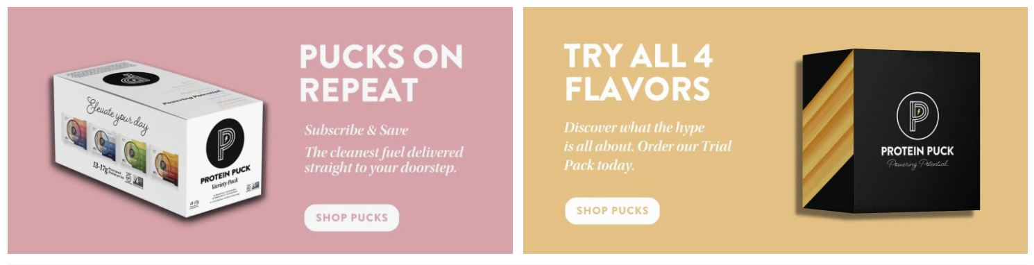
We also love the easy click access to purchase a low-commitment 4-flavor sampler pack, and are given added confidence that we’ll like what we receive given the prominence of the Subscribe & Save option.
We covered a lot about what we like from each of the above Stores, but it all boils down to a few beautifully executed musts any brand can employ…
Your top navigation should include links to the most important categories and pages of your Store, including a Follow button and Posts button, if those are available for your brand.
Jake King, Sr. Art Director, Creative at Tinuiti, encourages brands to also include links to live ASINs (product pages) within their category pages navigation.
“Each category page should have live ASINs built into module selection, not just a “menu” of subcategories.”
— Jake King, Sr. Art Director, Creative at Tinuiti
Just like a first impression, your first image or video makes a huge impact. Be sure to use this space thoughtfully, giving shoppers an overview of what they can expect from your brand, highlighting a new product, or leading them to your most important or popular category page. Also inject motion whenever possible, whether through a looping video or simple GIF.
Text overlays help convey the most important information about your products. This will vary depending on the product type, but might include charge time for electronics, material takeaways for clothing, or notable product features and differentiators.
That said, there is one concern with over-relying on text built into the image: It can’t be automatically translated.
“Crafting store modules with fixed-on graphic text-overlay might allow for your brand to have full control over the design, but will highly limit browser text translation.”
— Jake King, Sr. Art Director, Creative at Tinuiti
Provide quick product highlights through images—like how long a battery lasts between charges—relying on videos for more in-depth information.
“Fully clickable modules will effortlessly enhance the user experience while driving interaction. Including button-like elements encourages users to click and explore.”
— Jake King, Sr. Art Director, Creative at Tinuiti
Having a beautifully designed Amazon Store home page is just the beginning, and each successive click should lead customers on a thoughtfully designed journey.
If you’re selling a large number of products on Amazon, sub-categories may be essential for the best user experience. For example, if users clicking through to your Menswear page are met with 100+ loose ASINs, they may quickly navigate away from the chaos. Breaking Menswear out into sub-categories will provide you with richer insights, and make the shopping experience more enjoyable.
“Consistency across Amazon creative will increase a consumer’s brand trust and loyalty. When A+ and DPI content align to your storefront, the consistent experience can positively influence purchase behaviors.”
— Jake King, Sr. Art Director, Creative at Tinuiti
Remember that while there are differences in approach and audience considerations when designing an Amazon Store compared to your own ecommerce store, many of the foundational elements apply no matter where you’re securing shoppers.
While brands can’t change the look and feel of Amazon itself to suit their target customers, Amazon Stores give you an unprecedented opportunity to carve out your own corner of the Amazon web. Luckily, this corner comes fully stocked with attractive features to help reflect who you are as a brand, and put what’s most important to your customers front and center.
If you’d like to take your Amazon strategy to the next level, check out our most recent Amazon & Retail Media Summit for actionable advice or contact us today to chat!
Download our Digital Ads Benchmark Report for a deep-dive on data across Google, Meta, Amazon, and more.

Editor’s Note: This post was originally published by Shannon Mullery and has been updated for freshness, accuracy, and comprehensiveness.