Top Social Commerce Examples [Detailed Strategic Advice]


Have you ever been looking through your social media feed, and seen a scroll-stopping product you’d like to purchase? Did you find yourself wishing you could buy it right then and there? With social commerce activations in place, now, you can.
Brands have taken notice of this growing opportunity to reach consumers where they are, and for good reason. According to eMarketer, there were over 100 million social buyers in 2024, with over 44% making at least one purchase on TikTok Shop. With the massive size of the market and sales volume increasing significantly each year, social commerce is not a channel that merchants should overlook in 2025.
In this post, we’ll cover how brands can leverage these native shopping experiences — called social commerce — to reach new audiences and boost sales. Let’s start with the basics.
Social commerce is the process of selling products directly through social media platforms, creating a seamless shopping experience for consumers and allowing brands to connect with customers where they already spend their time. A growing number of platforms, such as Instagram, Facebook, Pinterest, and TikTok, now offer in-app shops to help businesses showcase products, engage users, and drive more sales. Consequently, social commerce is becoming an essential part of e-commerce.

Social commerce is a subset of ecommerce, but it’s a little different than social-powered ecommerce of yesterday. In the past, online shoppers would discover a new product in an organic or paid social media post, then click through to the brand’s website to make a purchase. Now, with social commerce, shoppers don’t have to leave the social media platform to make a purchase with Apple Pay, Meta Pay, Google Pay, PayPal, or a credit card.
Social commerce has become an essential element of the ecommerce mix, driving meaningful results for brands across industries. Below, we’ll explore the key social commerce vehicles and their benefits, focusing on their ability to extend reach, drive engagement through user generated content, leverage all types of data, and facilitate seamless in-platform shopping.
By integrating social commerce into your strategy, you can reach more of your target audience, boost brand awareness through UGC, streamline the purchasing process, leverage data for personalization, and generate organic social proof. The synergy of these tools allows brands to engage with consumers in meaningful ways, driving both revenue and long-term customer loyalty.
Now that you know the basics behind social commerce, it’s time to learn from the pros. Check out a few of our favorite social commerce examples below so you can get inspired for future campaigns.
Wrangler is one of the oldest brands of American jeans, with its initial founding in 1904. Ever since, Wrangler has maintained its focus on durable jeans that balance comfort, functionality and classic western style. However, they’re no stranger to blazing new paths into the digital world, as evidenced by their continued investment in social commerce and OTT advertising.

Their marketing team already had a fairly mature social media marketing strategy, and knew they were properly targeting their audience with relevant ad creative on Snapchat. This had a positive impact on brand value, but that value wasn’t translating into return on ad spend. After analyzing their campaign performance, it was clear that most viewers were leaving the site shortly after clicking on the ad. This wasn’t happening on other platforms – so Wrangler tapped our paid social services team for help.
Together, we found Wrangler had been using click-based optimization, which targets Snapchatters most likely to click on an ad at a specified cost-per-click. At the same time, Snapchat had just released a new landing page view (LPV) optimization goal. We decided that trying this method could either solve the problem, or at least help us with landing page optimization initiatives for Snapchat.
In Wrangler’s case, this new type of targeting made all the difference. Shifting to LPV optimization resulted in a higher cost-per-click – but this was outweighed by a 38% increase in impressions, a 380% increase in purchases associated with Snapchat campaigns, and a 212% increase in return on ad spend (ROAS) compared to their previous campaign.
This should serve as a valuable case study in how to optimize social commerce strategies. When brands juggle countless channels, some of the newest advertising opportunities are bound to go unnoticed. Remember to always keep up with developments in the world of social media marketing – and never lose your appetite to test new campaigns.
Liquid IV, a hydration brand popular among fitness enthusiasts and travelers, recognized TikTok as a key platform for audience engagement. As an early adopter of TikTok Shop, they integrated it into their ecommerce strategy to reduce friction in the buying process and drive impulse purchases.
While Liquid IV had a strong presence on social media, they sought to maximize conversion efficiency by leveraging TikTok’s native commerce ecosystem rather than relying on traditional ad-driven pathways that required multiple steps before checkout. Their goal was to improve conversion rates and attract new customers without losing potential buyers to drop-off points in the purchase funnel.
First, TikTok Shop presented a clear opportunity to remove friction in the buying process. Through their shop, users could purchase Liquid IV products directly within TikTok instead of clicking through to an external website. This streamlined the path to purchase and patched common leaks in the funnel, like manual entry of payment details. Then, Liquid IV ensured that their TikTok Shop product pages were optimized with clear product descriptions, competitive pricing, and limited-time promotions to further drive urgency.

At this point, Liquid IV had built their shop – and now they just needed the customers to come. So, they used TikTok’s affiliate program to put out a call for creators. Using this program, brands can ask creators with an audience of at least 5,000 followers to promote their products, offering them a small fraction of each completed sale as payment. This led to many of their approved affiliated posting reviews of their new Firecracker Popsicle flavor.
This user generated content had an earth-shattering impact. Engagement went through the roof, with one affiliate’s video prompting approximately 59,000 orders of the hydration packets overnight. 88% of these purchases came from first time customers too, meaning that the affiliate program succeeded in reaching audiences that Liquid IV struggled to find before. Additionally, Liquid IV continued to experience a lingering halo effect on other sales channels due to the viral video.
However, there were still some areas for improvement. With 59,000 orders coming in almost overnight, Liquid IV experienced firsthand how rapid sales spikes can strain inventory. While achieving virality can be a fickle business, it’s important for brands to anticipate and prepare for these fluctuations when launching social-first campaigns to avoid stockouts or fulfillment delays. This underscores the importance of inventory and demand planning before putting out a call for creators.
It’s clear social commerce is taking the industry by storm, but which platforms are rising to the top? Let’s break down some of the top platforms for social commerce and how the shopping experience works on each.
Facebook, owned by Meta, has been paving the way for social commerce in recent years. The platform has created the option for brands to construct online storefronts, AKA Shops, where consumers can browse and ultimately purchase products directly within Facebook.
Note: Shops are free to create but charge a fee when Facebook’s native checkout is used.
Facebook Shops is a culmination of online shopping features released the social platform over the years, including Facebook Marketplace, Native Checkout, and Live Video Shopping. Within Facebook Shops, businesses can create custom collections and tags to better reach customers, and according to Facebook, “any seller, no matter their size or budget, can bring their business online and connect with customers wherever and whenever it’s convenient for them.”
Closing the gap between finding a new product and purchasing has become much easier when leaning into shopping ad units on Facebook and Instagram, such as the use of product tags or Instagram shops. Brands are going to need to ensure they are playing in this space in order to keep up with the fast-moving nature of its consumers.
– Chelsea Dyjak, Sr. Manager, Paid Social at Tinuiti
If a brand doesn’t have access to Facebook Shops or Facebook’s native checkout, there are still opportunities to leverage social commerce. Facebook Marketplace allows users to purchase from local and ecommerce businesses alike without having to leave the Facebook app.
If you’re looking to put money behind your social commerce efforts on Facebook, you can do so by exploring Dynamic Ads, Collaborative Ads, Collection Ads, and Product Tags to get even more eyes on your products.
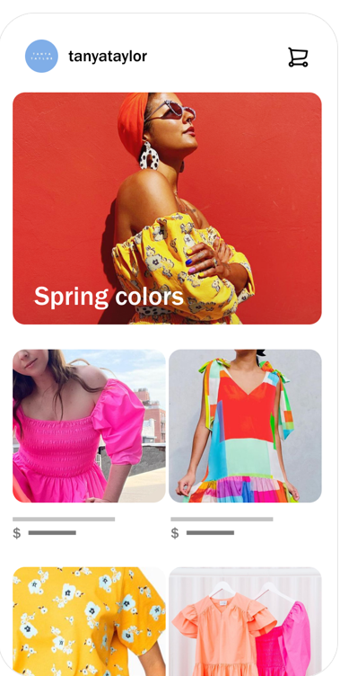
Instagram has very similar social commerce features to Facebook as they both embrace digital storefronts called ‘Shops’. When you set up your ‘Shop’, you have access to a variety of Instagram’s social commerce features like…

“We continue to see social platforms rolling out new paid and organic commerce features. We have already seen shops take off on Instagram and new features like live stream shopping and AR shopping on Snapchat also promise some success. I anticipate that we will continue to see more commerce products released this year playing further into the AR and video space.”
– Natasha Blumenkron Mears, Director of Paid Social at Tinuiti
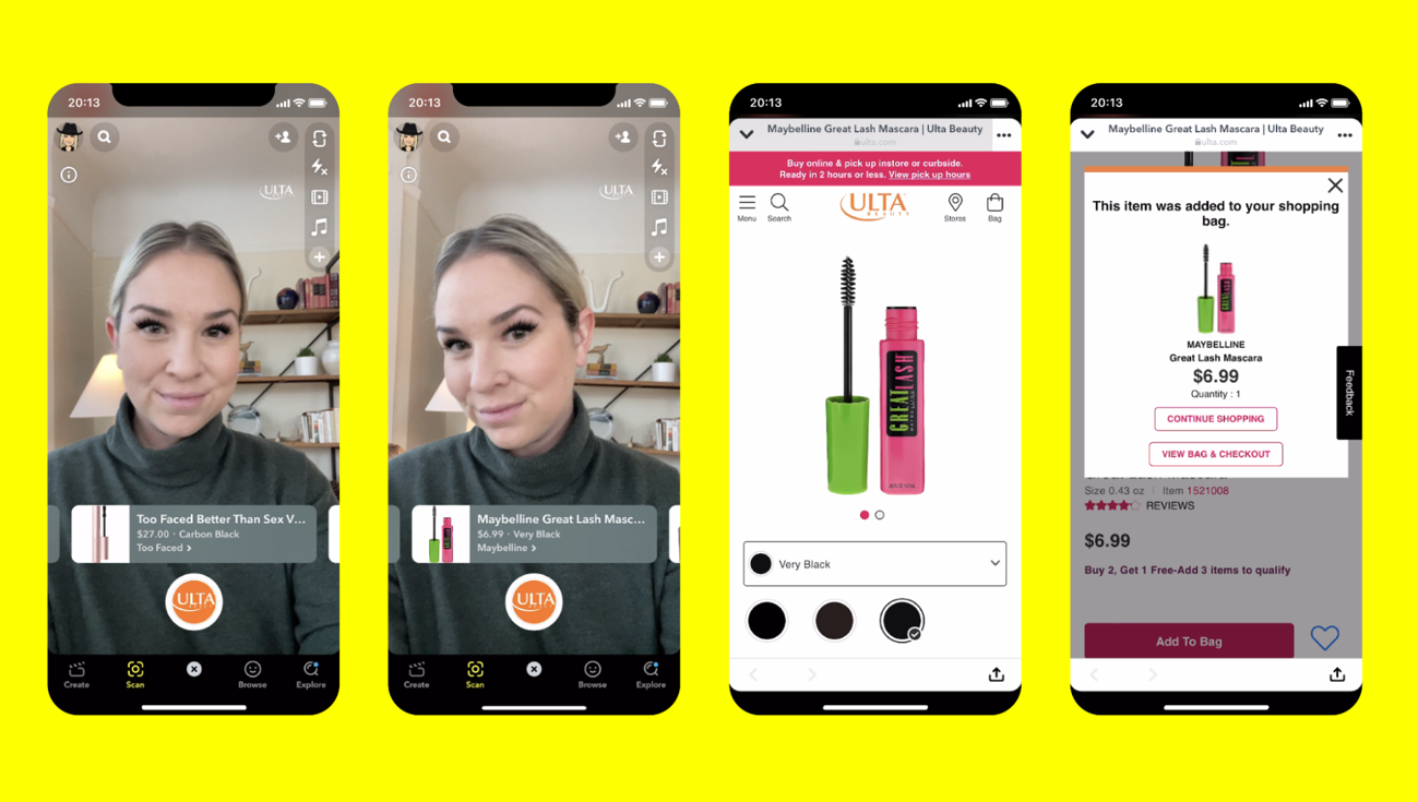
Snapchat is also embracing the social commerce world in exciting and innovative ways. The social platform is leaning into augmented reality (AR) to reach consumers in a new and engaging fashion. Snapchat advertisers can work with the platform to create lenses that allow users to try on makeup, eyewear, clothing, and so much more. Users can then review product information and click on a link to purchase through Snapchat’s native checkout or through a brand’s online store.
Snapchat reported that “Snapchatters are now engaging with AR more than 6 billion times per day, and 93% of them are interested in using AR for shopping.” Brands can also try out a “shopping lens” where users can swipe through multiple products from a merchant’s catalog in one place.

Snapchat’s scanning feature also utilizes partners like Yuka and Vivino to help users scan up to 1 million food products showing nutritional information, ingredients, and links to learn more and purchase products.
If you’re not quite ready to tap into AR, Snapchat has more traditional shopping offerings as well. Brands with a verified public profile for businesses can connect their product catalog and open a Store, allowing consumers to shop their products directly within the app. From there, brands can invest in paid, organic, or influencer content to start selling directly within the platform.
Brands can utilize a variety of ads to easily drive conversions from the app. According to Snapchat, with the use of Dynamic Product Ads, “you can cast a wider net on the app and find prospective customers by serving them relevant products built directly from your product catalog.”
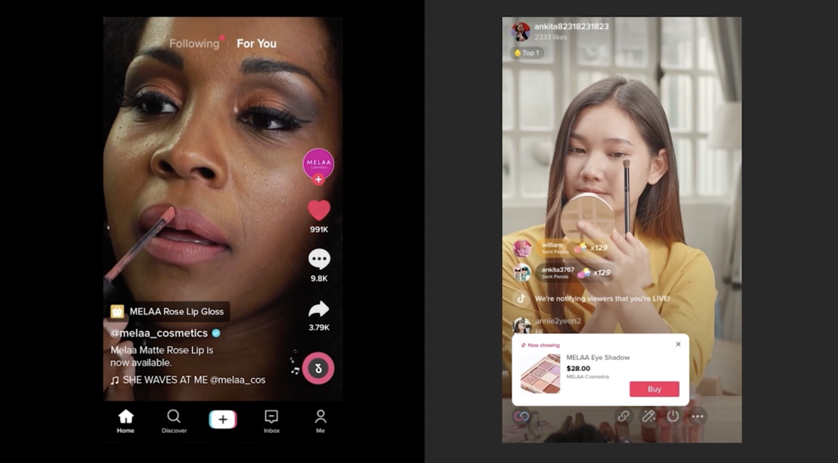
TikTok may be the newer kid on the block when it comes to social platforms, but with its growing popularity, the app is not lagging far behind when it comes to social commerce. In recent years, TikTok has gone all-in on a suite of solutions, features, and advertising tools that empowers brands and merchants to meaningfully engage with their customers. Despite its young age, Snapchat is one of the most mature social commerce platforms available today.

Brands such as e.l.f. saw big wins in recent years to the rise in TikTok engagement. e.l.f. Beauty partnered with Tinuiti in late 2019—shortly after we worked with the vegan beauty brand to create an integrated strategy across the social platform ecosystem.
Part of this strategy included launching three new channels for the brand—Snapchat, Pinterest, and TikTok—as part of their “e.l.f.ing Amazing” brand campaign. With this launch, Tinuiti helped e.l.f. become the first-ever beauty brand to advertise on TikTok. Our efforts resulted in 31M video views and 548,000 new users to elfcosmetics.com in just 90 days. This campaign ultimately helped lead to a greater engagement with TikTok—which included the viral #EyesLipsFace campaign.
“TikTok continues to disrupt the standard purchase journey as consumers on TikTok are looking for brands to entertain and allow them to participate, all while building trust through social proof. TikTok has changed the way that brands interact with their customers and we continue to see organic and paid solutions create viral shopping patterns through authentic UGC content.”
Rachel Legere, Director of Paid Social at Tinuiti
Did you know that 75% of weekly Pinterest users say they’re always shopping? Pinterest users are highly engaged and often start their shopping journey on the app. It’s an excellent hub for finding inspiration, but it’s also an amazing place to purchase products with their updated social commerce integrations.
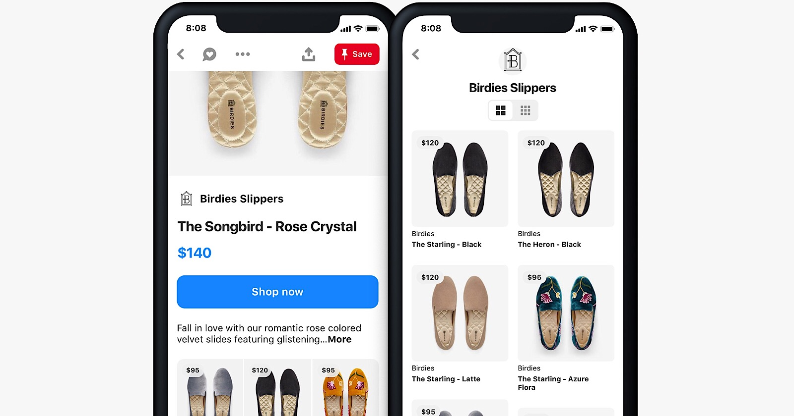
If you’re interested in placing products on Pinterest, the first place to start is by setting up a catalog which is “a feed ingestion tool designed for businesses that sell products on their websites.” Once you’ve created a catalog, you can then create and manage product groups which is a collection of products that you’d like to feature on the Shop Tab Pinterest hosts or through promoted ads on their site.

There are a variety of advertising options on Pinterest to choose from where brands can feature specific products including Dynamic Shopping Ads which serve single image ads that promote a product relevant to people’s interests with helpful details such as delivery times, reviews, and promotions. There is also an option to utilize Shoppable Collection Ads which mix lifestyle imagery and video for an enhanced shopping experience where brands can link up to 24 products.
Pinterest also has a social commerce feature called Shopping List. This newer feature automatically saves a user’s product pins into a central hub so when the time comes to make a purchase, the pinner can have easy access. In the Shopping List, users can see the price of the product, reviews, and pinners also get a notification if an item in their Shopping List drops in price.
Additional shopping features from Pinterest include:
Below our experts highlighted top tips to keep in mind whether you’re new to social commerce or have been leveraging this tactic for some time. Take a look at their recommended best practices (from the crawling stage, to walking, to running) so your brand can be set up for social commerce success from the start.
It’s important to make sure that any pixels or conversion API integrations are set up correctly to ensure your ads are optimized and engagement is measured accurately.
The process for event tracking is a little different depending on which platform you choose. The baseline requirements are usually installing a platform-specific pixel on each of your webpages, usually right into your site’s layout.html file. From there, look within your platform’s campaign setup options for an “Event Builder.” From there, you can tell the platform which events their pixel should measure.
Social media product feeds are critical components to having a successful social commerce strategy powering dynamic product ads, product tags, collection ads, and live shopping. Before diving right into the world of social commerce, make sure your brand has up-to-date, accurate product feeds so you can set up your campaigns for optimal results from the start.
Ensure your product information is rich, optimized, and frequently updated across platforms to ensure the best marketing performance possible. This will help your store accurately reflect your product pricing and availability, helping you avoid wasted ad spend on promotions featuring incorrect prices or out-of-stock products. Once the fundamentals are in place, brands can take their strategy further by testing different product titles and images in ads or leveraging performance-based feed labels to refine targeting and campaign effectiveness.
Each social commerce offers a variety of dynamic feed-based solutions that brands should explore to maximize their reach and effectiveness without expending too much manual effort to update relevant information.
Dynamic feed-based solutions allow businesses to automate and personalize their advertising efforts. Platforms like Meta, TikTok, and Google offer solutions that dynamically pull in product details—such as images, prices, and descriptions—so that ads stay relevant with limited hands-on effort required. For example, TikTok’s Video Shopping Ads use real-time product feed data to enhance discoverability.
The exact method for implementing dynamic feeds depends on the social commerce platform utilized and the ecommerce platform that the merchant uses. For example, Shopify can automatically sync your site’s actual product information to TikTok Business Center and other mainstream social commerce platforms.
Product tags give social media users an official, trackable way to call out your product and direct viewers straight to your store page. In addition to simplifying the shopping process and boosting sales, tags also encourage the creation of user generated content. This makes product tags are a win for both branding and sales initiatives.
For example, Liquid IV’s affiliates used product tags to help launch their new Firecracker Popsicle flavor. When a follower clicked on the tag, they’d be brought directly to Liquid IV’s TikTok Shop. This way, Liquid IV was able to accurately track engagement information while creating a seamless shopping experience at the moment of discovery.
As we covered, utilizing ‘Shops’ within Meta, Pinterest, TikTok, and Snap is a great way to increase your success with social commerce. These shops provide a more seamless, native shopping experience through features like shoppable links and in-app checkout.
In many cases, consumers only need to see someone show off your product on social media and follow a tag to view the product page. After they cart the product, the platform already remembers their payment details, making a confirmed purchase require just a few taps from start to finish.
Basically, Shops provide a way to turn your social media engagement directly into sales.
Testing is a critical part of any advertising or marketing campaign. Social media platforms continually introduce new ad types and features, making experimentation essential for staying competitive.
Experimenting with a little spend on new ad formats and ad creative can improve conversion rates and prevent unnecessary spending. For simple creative testing ideas, trying changing out your ad’s frames, price overlays, images, and call-to-action buttons to identify what resonates most with consumers. Or, you could split test collection ads to deduce the best products to promote to a specific audience.
Whether it’s dynamic product ads, shoppable posts, or interactive formats like live shopping, continuously testing and optimizing will help you maximize results and find the best strategies for your brand.
“When it comes to social commerce, it’s crucial to test early and often. Following platform best practices is an important first step, but what works for one brand may not be the optimal strategy for another. Seek to understand the unique product, audience, and ad type strategies that suit your brand’s needs. As credit card integration becomes more prevalent within our devices and social platforms, ecommerce will only account for more and more of brands’ annual sales.”
– Chris Stokes, Sr. Manager, Paid Social at Tinuiti
Adoption of social commerce is reaching new heights each year, but it remains a relatively untapped channel for many brands. If your brand has been considering a social commerce strategy, the best time to test one out is right now. By following a few best practices, you can take the first steps toward maximizing the value of your social media strategy.
If you’re ready to embrace all that social commerce can offer your brand, you’ve come to the right place. At Tinuiti, we have teams of experts specializing in all forms of online commerce and social media. With decades of relevant expertise, we’re on the cutting edge of helping brands improve social commerce game and drive more conversions.
For more information, please visit our Commerce service page or contact us directly to get started.
