A brand’s ad design is often the first impression it makes on a consumer. And this first impression can be a make-or-break moment on a social platform like Facebook, with millions of other ads competing for a viewer’s attention.
A frequently-cited Nielsen survey found that 47% of a brand’s sales lift from advertising came from the creative. In contrast, another study found that the image elements of social media ad design significantly (41.6%) impact consumers’ purchasing decisions.
In some marketing departments, creative design can take a back seat to the targeting and audience-building tools Facebook offers. But with more advertisers and audience overlap than ever, testing and optimizing your Facebook ad design is worthy of your careful attention.
Here are 15 ad design and ad testing best practices for optimizing the creative of your ads across Facebook and other social channels.
“Your ad design and testing processes are the cornerstone to moving paid social performance. All these platforms are so visual that you really need to have content that stands out to ensure your brand is being seen and heard.”
– Avi Ben-Zvi, VP, Paid Social at Tinuiti
1. Set Measurable Performance Goals
Before we dive into the mechanics of ad design, it’s important to establish the purpose of the ad. What is the overall advertising campaign designed to achieve, and what are the specific objectives of the individual ad as defined by Facebook?
Facebook ads can build brand awareness or promote a new product, drive interest in a brand or generate incoming leads. Some of these goals are more easily measured than others, but they should all be tracked to determine overall campaign performance. Facebook offers more specific metrics in its Ad Manager tool, including lead capture, website traffic, local reach and event sign-ups – but note that as of 2023, Meta is taking steps to simplify these objectives.
Ensure all your business goals are specific, measurable, attainable, relevant to your business, and aim to attain them in a set timeframe. This will allow you to quickly assess the performance of your ads and campaigns without putting too much money into campaigns that aren’t resonating with your target audience.
2. Make Your Facebook Ad Design Facebook-Specific
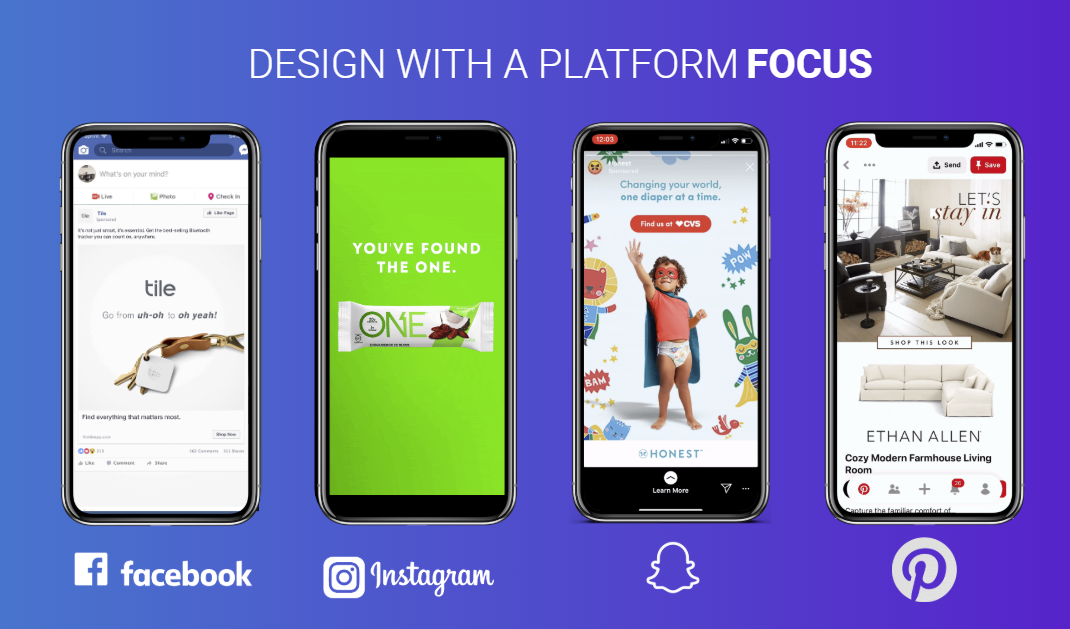
Even with consolidation among social platforms, a “one-size-fits-all” approach to your ad creative might seem efficient, but it won’t generate optimal results. Not only are ad specs different for each platform, but the audience and use cases for each social platform are also very different.
Understanding the nuances of each platform and what users expect to see are important considerations to make when designing your ad. For example, a Promoted Pin ad may have too much text or too many visual elements, making it ineffective as an in-feed Facebook ad. Or, the audience that watches your Snapchat Stories may have different values than those who see your Facebook Stories.
Much like your campaigns should focus on a single audience and goal, your ad designs should also focus on a specific platform, its design guidelines, and the audience using that platform. For example, take a look at best practices for Feeds and Stories on Facebook:
Facebook Feed Ads:
- Promotion should be communicated in the image/video
- Text should encompass less than 20% of the creative
- Reiterate your CTA in the headline copy
Facebook Stories:
- Start with your key messaging and branding
- Keep your narrative fast-paced
- Try text overlays, stickers, and polls.
Then, compare this to Pinterest Ads and Snapchat Stories:
Pinterest Ads:
- Use text overlays liberally to describe product benefits or styling tips
- Keep messaging seasonally relevant and update it often
- Avoid sales-oriented text or creative
Snapchat Stories:
- Use 3-5 second video advertisements to showcase hero messages
- Develop curated collections with 3 to 20 swipe-able panels
Since best practices differ from platform to platform, a Snapchat Story could not double as a Facebook Story without some fundamental changes to its design.
3. Design for a Particular Ad Format
As a platform, Facebook offers the most comprehensive array of ad formats, and that variety is constantly expanding (currently, eight formats are available). It’s important to familiarize yourself with an available ad format’s unique qualities and advantages, then designing an ad based on the format’s strengths.
Content and intent are two design elements to consider. Compelling, storytelling images work best for Photo ads, while text-over-image may be less effective in Stories. For example, Carousel ads might be ideal for highlighting a suite of products or telling a step-by-step brand story across multiple image “cards.” Ads delivered through the Messenger format are more suited to individualized engagement and soliciting feedback.
Here are the 8 Facebook ad formats and what they’re best utilized for:
Photo – The most basic Facebook ad, a clean, simple format to feature engaging imagery and copy. Best for telling a brand story with a powerful image.
Video – These ads come in various lengths and styles—from short, feed-based ads to longer videos. Best for a more comprehensive showcase of your brand, product or service.
Stories – Appearing outside the Feed and opening up to full-screen upon selection, Stories offer an immersive ad experience for the user. Best for capturing attention and making a big splash.
Carousel – Carousel ads let you showcase up to ten images or videos in a single ad, each with its own link. Best for highlighting a range of different products or services or telling a brand story in chapters.
Messenger – These ads are delivered through the Messenger application and can feature individualized content and interactive elements. Best for starting a conversation or driving specific actions.
Slideshow – Slideshow ads are video-like ads made of images, motion, sound and text. Best for reaching users with unreliable connection speeds.
Collection – Collection ads let people discover, browse and buy what you offer. People can tap an ad to learn more about a specific product. Best for displaying products your brand offers.
Playables – Playable ads offer people an interactive preview before downloading an app. Best for promoting or gauging interest in new games or apps.
While each ad should be designed for its intended format, you can get great results from mixing and matching formats within an overall campaign. Always align your objectives with the ad formats you’re using.
4. Create Images for a Specific Ad Placement
Ad placement affects ad specs, which determines your ad design space. It also impacts how likely your ad is to be seen and what a user’s intentions are when encountering it. While some ad formats are served to Facebook users in consistent places (Stories, for example, are always outside of the Feed), other ads can appear in different areas.
There are six common ad placement locations on Facebook. These include:
- Mobile Feed – Appears on a user’s Feed when they use a mobile device.
- Desktop Feed – Appears on a user’s Feed when they use a desktop device.
- Desktop Right Column – Small and inexpensive image ads that appear to the right of a user’s Feed on a desktop device.
- Stories – Full-screen advertisements that are less than 15 seconds long and appear when users view user-generated Stories.
- Marketplace – Ads placed in the Facebook Marketplace, usually promoting a product that’s ready to sell.
- In-Stream Video – Ads that play before or during a video uploaded to Facebook, similar to those that appear on YouTube.
Understanding how your target audience uses Facebook goes a long way toward informing which ad placement is best for your brand. Does your audience mostly use the Facebook mobile app? Do they spend a long time watching videos in their Feed? As with other social media advertising approaches, you can optimize your ad placement to reach your target audience most effectively when you have insight into their existing behaviors.
5. Build Creative Assets for Specific Dimensions & Specs
Once you’ve chosen which ad placement is best for your brand, keep the relevant ad specs top of mind. Here’s a quick rundown of specs for various Facebook ad types:
Single Image Ads with Links:
- Image Minimum Size (WxH) – 476 x 249 pixels
- Image Ratio – 1.91:1 to 4:5
- Image Resolution – at least 1080 x 1080 px
- Headline Text – 25 characters
- Link Description Text – 30 characters
Single Video Ads
- Format – .MOV or .MP4 are recommended but other formats are supported
- Video Ratio — 9:16 to 16:9
- Resolution – 720p at minimum, upload the highest resolution possible
- File Size – 4 GB maximum
- Length Minimum – 1 second
- Length Maximum — 240 minutes
- Thumbnail Image – No more than 20% text
- Vertical videos with an aspect ratio higher than 4:5 can be masked to 4:5
Video Story Ads
- Aspect ratios: 9:16 and 4:5 to 1.91:1
- Maximum duration: 60 secs
- Maximum file size: 4 GB</span
- Minimum video width: 500px
- Supported video types: .mp4, .mov
- Sound: Optional
As you consider the image and video specifications for each ad format, think about the kinds of images and videos that work best within those specs. Does it make sense to left-align text overlays for desktop images? Or create a video with more edge-to-edge action for Stories or Reels? In both cases, the answer varies on your creative direction and ad objectives.
6. Create Different Ads for Mobile and Desktop
Most Facebook users access the social network on their mobile devices, so vertical orientation and a mobile-first approach should be your default. Of course, you should always optimize each ad for its format and placement.
Your brand’s particular audience may differ, so it’s always a good idea to understand their habits and motivations when designing ads. Acknowledging variations in usage type between mobile and desktop also makes a strong case for tailoring your ad design to each format.
Facebook users also access their mobile and desktop apps in different frames of mind, which should also be considered. Mobile users can fill idle minutes by scrolling through their Feeds and Stories or searching for specific information on the go. Desktop users typically engage for longer periods and gravitate toward content that makes use of larger screen sizes.
7. Use an Attention-Grabbing Value Proposition
Capturing attention is any advertisement’s first and most important priority. Facebook ads are no different; users will scroll right by an ad if it doesn’t catch their notice or pique their immediate interest. So it’s a best practice to put what consumers most care about – the value the ad represents to them – front and center.
Your value proposition should be short and easy to understand at a glance and, when possible, be featured within the image or video itself. It should be urgent but in line with your brand image and tone. Most importantly, it should be compelling to the user.
8. Always Include a Clear CTA
A call to action (CTA) should be brief, provide users with a clear next step after viewing the ad, and contain action-oriented words that encourage a click-through. They should be related to the value proposition communicated in the ad and easily actionable.
CTAs usually appear in the description underneath the image, though in specific ad formats like Stories or Carousel, they can appear within the image or afterward as an overlay. But wherever it appears, every effective Facebook ad needs a clear CTA.
9. Capture Attention with Clear Messaging and Concise Text
Just as clear and concise value propositions and CTAs are best practices for Facebook ads, so is keeping ad copy and videos short and to the point. There is a place for longer-format text and lengthy video clips in organic Facebook content, but shorter is almost always better for ad design.
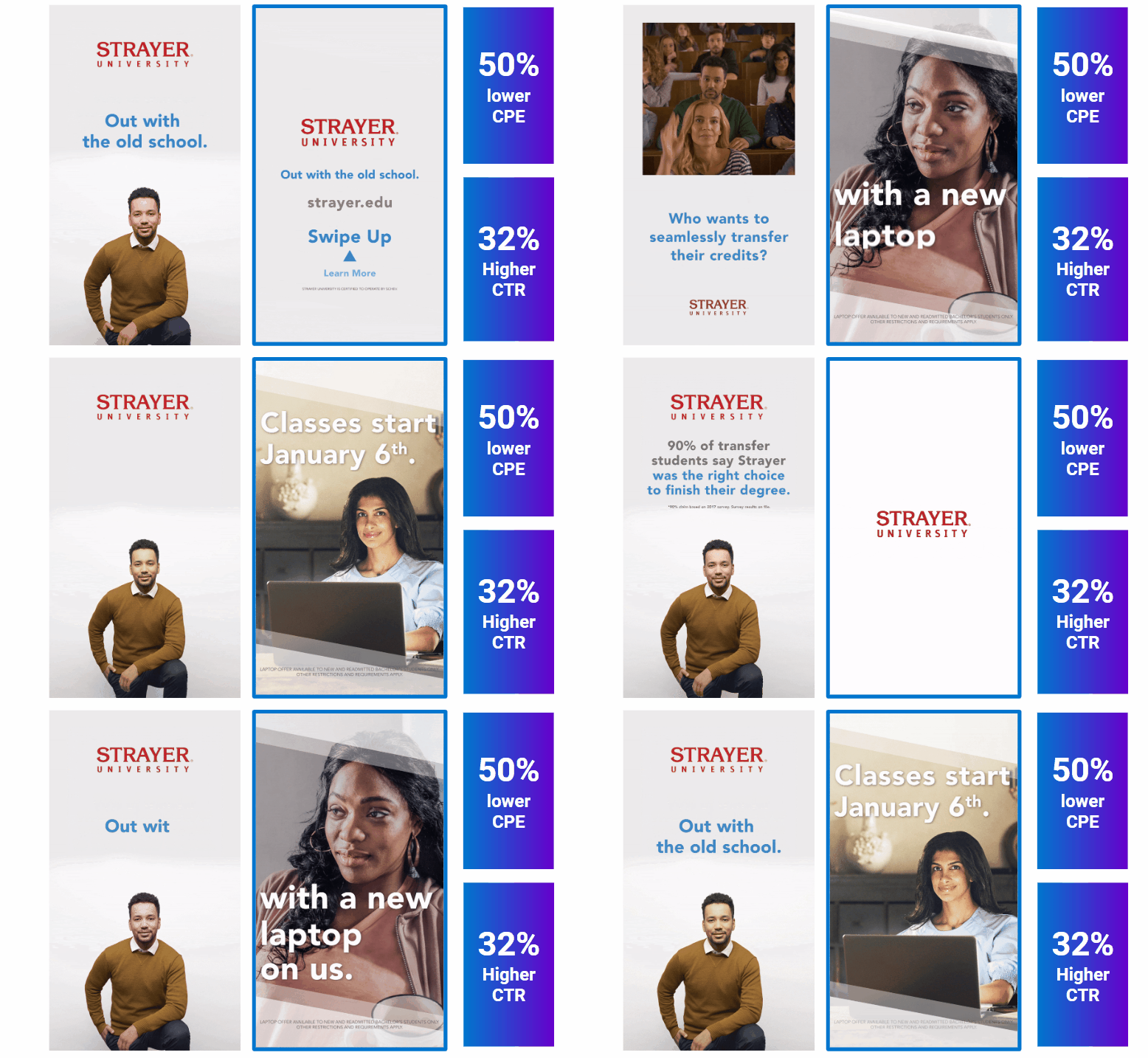
At Tinuiti, we saw proof of this concept when testing video ad length for Strayer University.
Ad testing revealed that the faster-paced 6-second ad drove higher and more efficient engagement than a comparable 15-second ad. The most effective ad featured its value proposition within the first 2 seconds and utilized more concise text overlays. With the Strayer campaign, we learned that 6-second ads resulted in a 50% lower CPE and a 32% higher CTR.
“Ultimately, the brand found that it’s so important to use a faster-paced storyline to communicate your messaging.”
– Kelsey Miller, Director, Paid Social at Tinuiti
10. Follow Facebook’s Ad Guidelines
The Facebook Ad Manager incorporates all relevant technical guidelines through the ad-building tool – but it won’t cover every one of Facebook’s content guidelines.
If your ad does not follow the guidelines, it will be subject to removal by Facebook. For that reason, it’s essential to familiarize yourself with both the Facebook Ad Guide and the Meta Community Standards and brand safety information when developing your ad content.
11. Use Color Theory to Your Advantage
As with any design, color is an essential element of Facebook ads, and it can go a long way toward capturing a user’s attention and directing their actions. There is a psychology behind the use of color, such as using yellow to convey optimism or blue to communicate trust and strength. Contrasting colors also can catch the eye, which is why you often see ads featuring colors from opposite sides of the color wheel. Contrast, when deployed in a Facebook ad, can help your message break through cluttered Feeds and grab users’ interest.
However you approach your ad’s color scheme, the colors you choose should work in harmony to support your brand identity and the purpose of your ad. You also want to keep your color usage relatively simple – two or three colors max, otherwise the ad will feel busy and overwhelming.
12. Make Your Ad Design Pop With GIFs and Video Assets
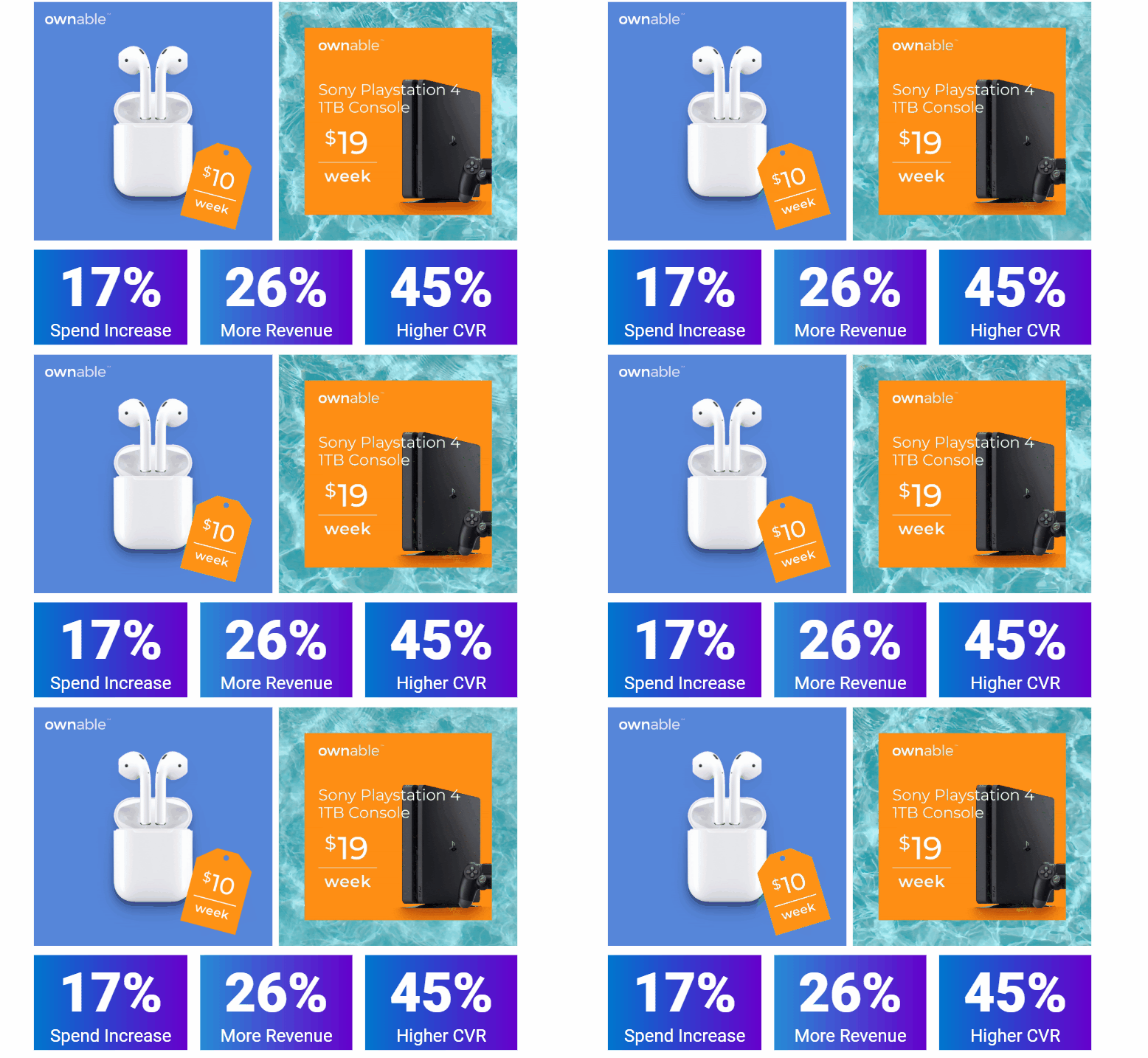
While moving images are only central to a few of the ad formats supported by Facebook, our experience helping companies devise and execute effective Facebook advertising strategies shows that they have an outsized impact. When tested against static images and long-form video, GIFs, in particular, saw higher CVR and revenue increases.
Our work with the retail brand Ownable on their US campaign produced GIF ad designs that achieved top performance during a promotion. The GIFs effectively highlighted the offers while keeping the product and brand front and clear.
After optimizing Ownable’s promo ads, we saw the following results:
- 17% spend increase
- 26% more revenue
- 45% higher CVR
The GIFs successfully captured consumer attention as they effectively highlighted the promotional offer while maintaining the brand’s and product’s prominence. They were eye-catching while staying to the point, creating an optimal environment to lock in consumers’ focus.
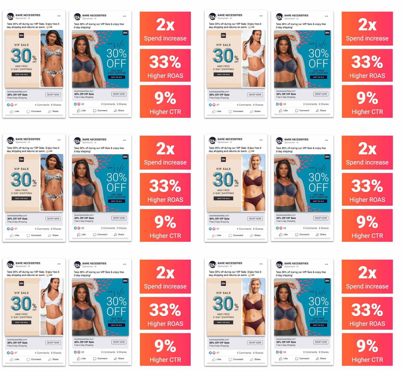
Bare Necessities also saw an enormous performance increase just by altering their ad design to a GIF format to make their offer pop more.
In this campaign, our creative and social teams collaborated to transform Bare Necessities’ static assets into GIFs. The new ads’ subtle movement caught users’ attention in the feed and led to higher website traffic and revenue.
13. Use Customer Reviews When Possible For Social Proof
Reviews can be a key reference point for consumers in their buying journey, so if your brand or products enjoy strong support among reviewers, it’s a good idea to utilize those reviews in your Facebook ads.
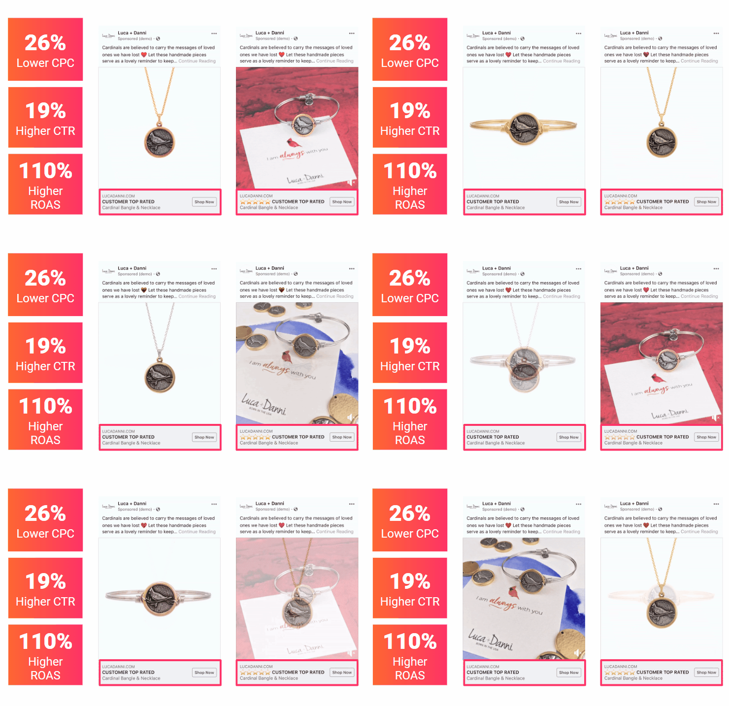
For example, when working with Luca + Danni, we compared the impact of positive reviews on Facebook ad performance by testing various ad creatives against each other.
Ad designs that included customer reviews within the post copy drove more efficient site traffic and purchases than the top-performing evergreen headlines.
We performed a single variable test for this campaign, comparing top-performing evergreen headlines against identical ads incorporating customer reviews. The ad creative that included customer reviews performed significantly better:
- CPC decreased by 26%
- CTR increased by 19%
- ROAS saw a massive improvement of 110%
When it comes to ad creative, consumers respond better to social proof. By including customer reviews within the ad, we gave the brand and product more social clout than it would have gotten with just a headline and image alone.
14. Encourage Product Exploration with Shoppable Collection Units
For consumer-facing brands, Facebook’s Collection ad format can be a great way to let people discover, browse and buy what you offer. But do they perform better than the more common image or video ad formats or organic page posts?
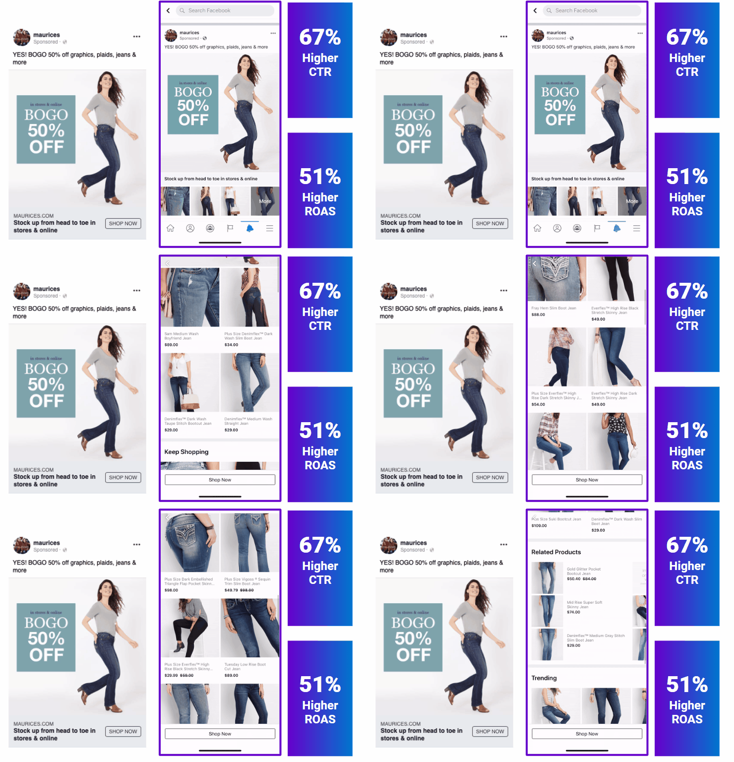
In a campaign for Tinuiti client Maurices, we tested whether Link Page-Post ads or Collection ads drove higher returns for sale periods. To do so, we ran two versions of an ad with near-identical creative:
Collection ads dynamically pulling in products dramatically outperformed link-page posts. The “sell products” ad design collection layout encouraged category exploration and increased purchase conversion rates.
We found that encouraging product exploration resulted in a 67% higher CTR and a 51% higher ROAS. Displaying a collection of products drew customers in and encouraged them to shop more actively for additional products than just those listed in the ad creative.
The key here is to make things easier for your consumers. By displaying collection ads relevant to the user, you’re making it easy for them to find products they’re interested in without the hassle of going to your website and scrolling through all your products.
15. Use A/B Testing to Fail Fast & Learn Fast
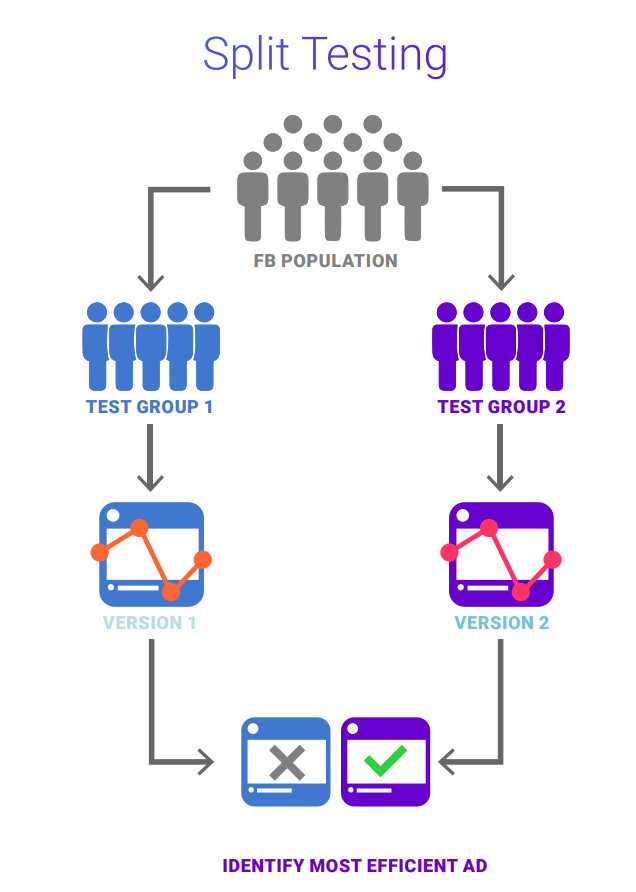
Split testing, also known as A/B testing or single variable testing, has long been a favorite method for marketers to discover which ad optimizations yield the strongest results for a brand.
Testing the creative variables within your ads is just as important as testing the ad format or audiences. By testing one variable at a time, you can more quickly identify which elements impact your performance in different ways. The Facebook Ad Manager offers A/B testing tools (and guidance on conducting A/B tests within the platform), but you can also implement split testing on your own.
For example, here are some basic split tests for ad imagery types:
- Lifestyle Vs. Product
- Professional Vs. User-generated
- Illustration Vs. Photography
- Light Vs. Dark Colors
- Text Overlays, Price Badges, and Copy
With this testing, you can optimize to make your winning ads perform even better. A/B testing will help you identify which variable is driving performance, then iterate on that variable to see continued success.
Conclusion: Prioritize Creative Ad Testing to Improve Ad Design Performance
Advertising on Facebook can be highly effective for your brand, but only if you nail your ads’ design elements. With so much variety available in terms of ad format, size, placement and content, it can feel overwhelming to develop the perfect ad campaign for your brand. They all have different rules, specs and utility, so what works on one may not work on another. But Facebook has plenty of tools to help you, and you can make the most of them by following these core principles:
- Tailor creative for the right Facebook ad format.
- Establish your KPIs and testing goals and test often. This way, you’ll be able to collect relevant data to analyze for future campaigns.
- Keep ad content short and simple to understand. Focus on capturing your audience’s attention and directing them to straightforward actions.
- Understand your audience. The ultimate best practice for any advertising campaign. Know your audience and what they care about, and effective Facebook ad design will flow naturally.
Want to learn how your brand can start enjoying the benefits of performance creative on social platforms? Look no further than our Creative Services team.
Editor’s Note: This post was originally published in January 2020 and has been updated for freshness, accuracy, and comprehensiveness.
You Might Be Interested In


